Flyer design: 50 brilliant examples you can learn from
Maybe you’re a business owner and you don’t want your marketing efforts to end up in the recycling bin. Or maybe you need to advertise an event or fundraiser for your club or community organization. Whatever your needs, check out 50 stellar examples below with design tips that will get you inspired for your next flyer design project. And when you’re all ready to design your own printed flyers, contact Asset Print for great flyer designs and printing offers.
Want more flyer inspiration? Then check out our round up of 20 bold, minimalist flyers – or if you prefer a louder style, get inspired by 20 vibrant flyer designs.
01. Embrace Color
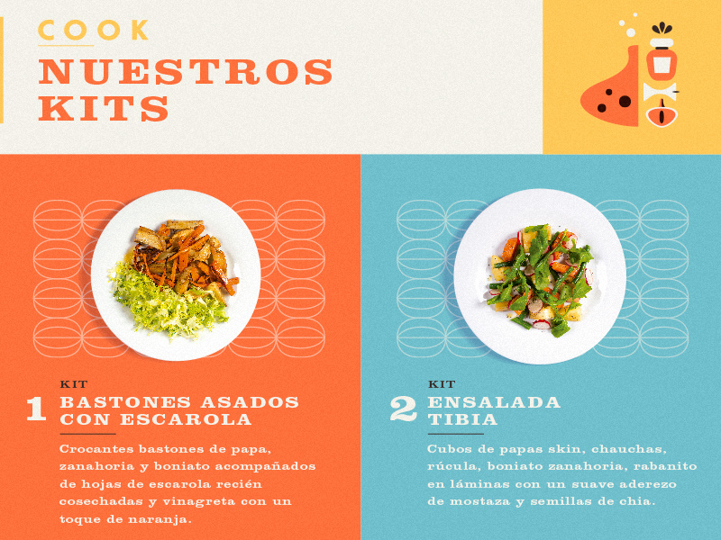
Bright, bold color palettes really give flyers punch and attract attention, even from across a room. This flyer design by Martin Azambuja uses vibrant hues that reflect the fresh ingredients of the dishes the flyer is advertising.
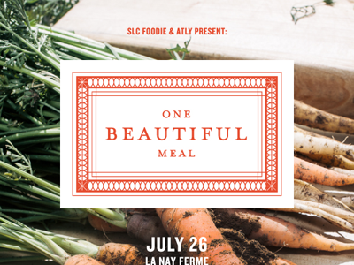
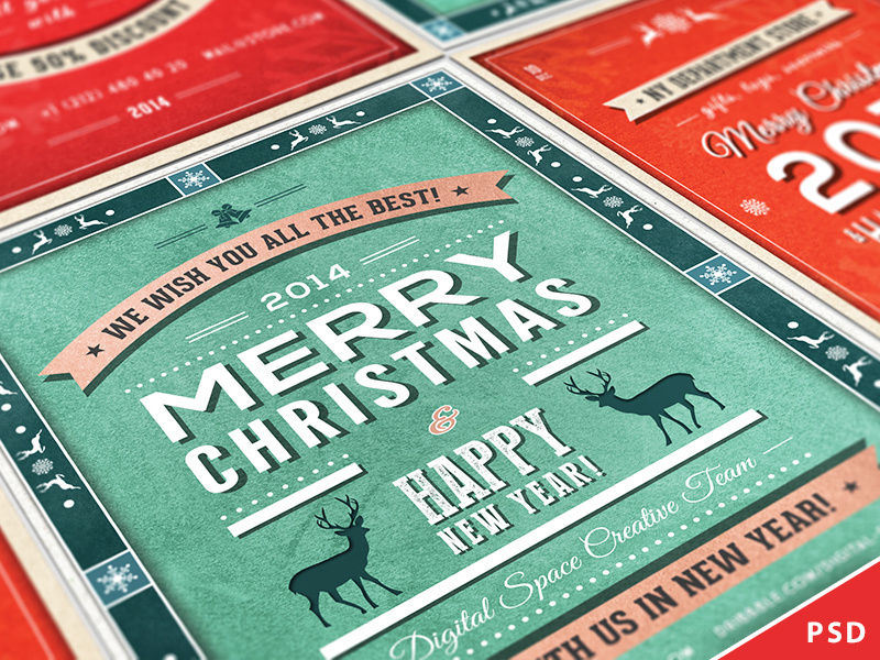
Combining different font styles and sizes can give your flyer a distinct look and help it stand out. In this piece from Overloaded Design, 3D effects on the text and some subtle, grungy textures also make the design pop.

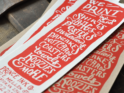
The handcrafted look is big right now (whether designs really are handmade or are just created to look like it). This screen-printed flyer from The Prince Ink Co. features whimsical, hand-drawn typography, which is very appropriate for a print company that runs all its prints by hand. Using a “form equals content" approach to design like this can be very effective.

Like patterns, shapes are a great attention-getter, especially when applied creatively. This flyer design by Justin Krout uses shape in both the text and the graphics. Notice how the tilting shape of the text makes for a unique and eye-catching title, while the mountain below is made up of triangles of all shapes and sizes, creating a multifaceted, almost 3D effect.

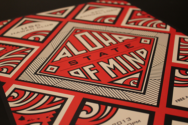
Finely detailed graphics can be stunning, but how do you avoid making your design look too busy? A limited color palette helps, as does a focus on symmetry and balance, like in this flyer design by Kristie Kam. This flyer also keeps things polished by sticking to a visual theme — in this case, a heavy emphasis on geometric shapes and patterns.
Choosing a cohesive color scheme (maybe the colors in your company’s logo) and/or staying in the same color family or temperature (warm or cool) really pulls your flyer design together. This folding flyer by Evan Travelstead sticks to cool blues and grays against bright white for a clean, polished look.
Paying close attention to spacing and alignment is an important step in the design process — one that can make or break a project. See how in this flyer by Pashlov Egor, all the icons in red are approximately the same distance apart? Though there’s a lot going on, everything fits together nicely, almost like puzzle pieces, without looking crowded.

When’s the last time you saw coupons with hand-drawn illustrations? Giving your design that extra personal touch, like Mel Larsen did in this flyer, will be sure to catch the attention of your viewers and give them a good impression of your brand or organization.

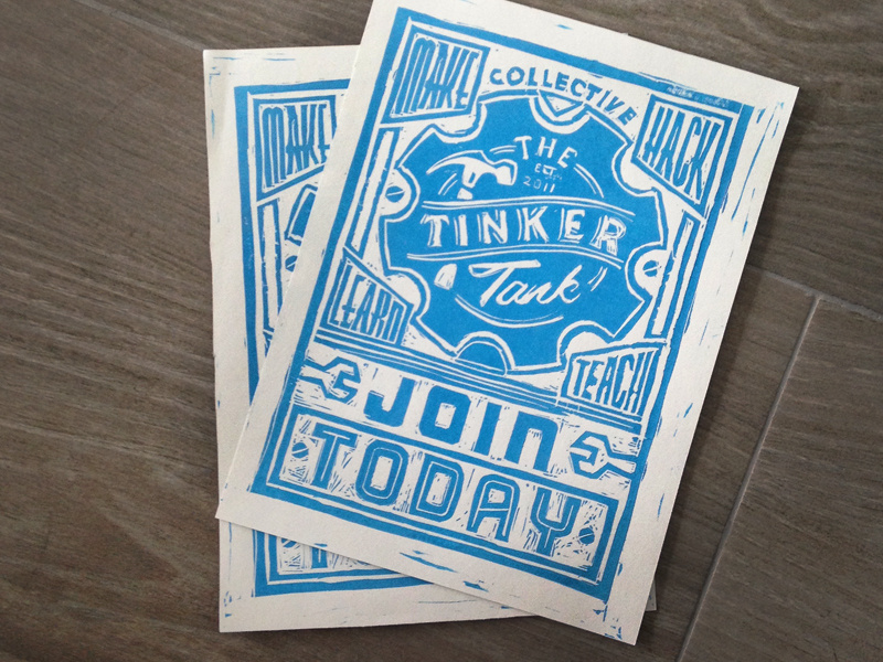
Designs that are textured or a little rough around the edges can be a nice contrast to all those more slickly produced flyers out there. As with this hand-carved block print by Jack Daniel Bagdadi, sometimes designs (much like people) are all the more appealing and dynamic for their little imperfections.
Take a page from art class and use the concept of leading lines. A common composition trick in art and photography, leading lines are just what they sound like — they lead in to the part of the image that the artist wants viewers to focus on. In this design by Macrochromatic, the diagonal lines of the mountains intersect with the sides of the red triangles to form arrows that point right at the band’s name.
Stay tuned for Part 2...
Posted on August 30th, 2018
Flyer design: 50 brilliant examples you can learn from
Maybe you’re a business owner and you don’t want your marketing efforts to end up in the recycling bin. Or maybe you need to advertise an event or fundraiser for your club or community organization. Whatever your needs, check out 50 stellar examples below with design tips that will get you inspired for your next flyer design project. And when you’re all ready to design your own printed flyers, contact Asset Print for great flyer designs and printing offers.
Want more flyer inspiration? Then check out our round up of 20 bold, minimalist flyers – or if you prefer a louder style, get inspired by 20 vibrant flyer designs.
01. Embrace Color
Bright, bold color palettes really give flyers punch and attract attention, even from across a room. This flyer design by Martin Azambuja uses vibrant hues that reflect the fresh ingredients of the dishes the flyer is advertising.

Combining different font styles and sizes can give your flyer a distinct look and help it stand out. In this piece from Overloaded Design, 3D effects on the text and some subtle, grungy textures also make the design pop.


The handcrafted look is big right now (whether designs really are handmade or are just created to look like it). This screen-printed flyer from The Prince Ink Co. features whimsical, hand-drawn typography, which is very appropriate for a print company that runs all its prints by hand. Using a "form equals content" approach to design like this can be very effective.


Like patterns, shapes are a great attention-getter, especially when applied creatively. This flyer design by Justin Krout uses shape in both the text and the graphics. Notice how the tilting shape of the text makes for a unique and eye-catching title, while the mountain below is made up of triangles of all shapes and sizes, creating a multifaceted, almost 3D effect.

Finely detailed graphics can be stunning, but how do you avoid making your design look too busy? A limited color palette helps, as does a focus on symmetry and balance, like in this flyer design by Kristie Kam. This flyer also keeps things polished by sticking to a visual theme — in this case, a heavy emphasis on geometric shapes and patterns.

Choosing a cohesive color scheme (maybe the colors in your company’s logo) and/or staying in the same color family or temperature (warm or cool) really pulls your flyer design together. This folding flyer by Evan Travelstead sticks to cool blues and grays against bright white for a clean, polished look.

Paying close attention to spacing and alignment is an important step in the design process — one that can make or break a project. See how in this flyer by Pashlov Egor, all the icons in red are approximately the same distance apart? Though there’s a lot going on, everything fits together nicely, almost like puzzle pieces, without looking crowded.

When’s the last time you saw coupons with hand-drawn illustrations? Giving your design that extra personal touch, like Mel Larsen did in this flyer, will be sure to catch the attention of your viewers and give them a good impression of your brand or organization.

Designs that are textured or a little rough around the edges can be a nice contrast to all those more slickly produced flyers out there. As with this hand-carved block print by Jack Daniel Bagdadi, sometimes designs (much like people) are all the more appealing and dynamic for their little imperfections.

Take a page from art class and use the concept of leading lines. A common composition trick in art and photography, leading lines are just what they sound like — they lead in to the part of the image that the artist wants viewers to focus on. In this design by Macrochromatic, the diagonal lines of the mountains intersect with the sides of the red triangles to form arrows that point right at the band’s name.
Stay tuned for Part 2...
Posted on August 30th, 2018
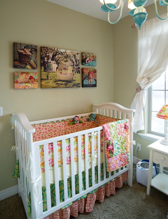
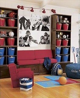
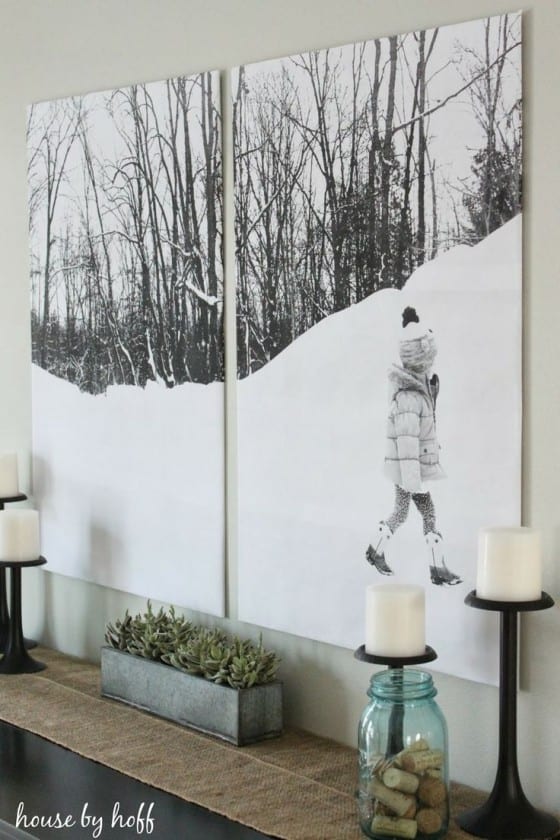
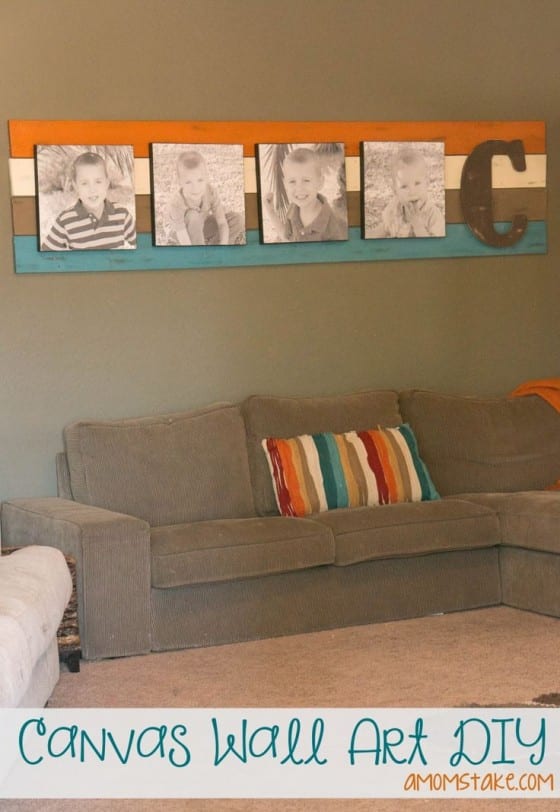
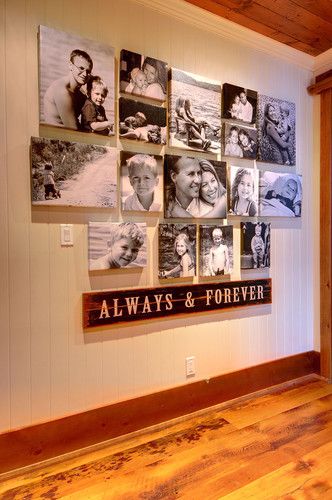
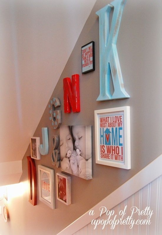
102 Canvas Print Ideas & Inspiration
Nursery & Kid’s Bedroom
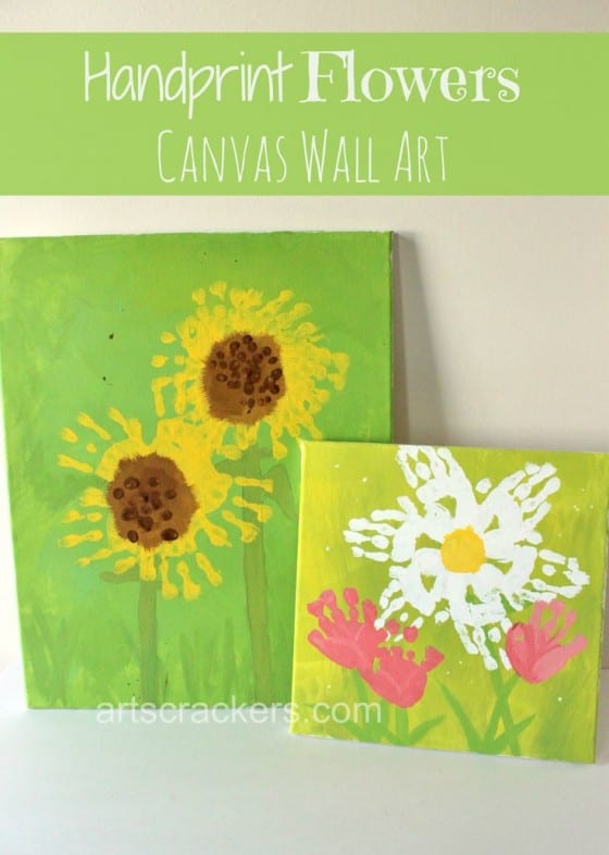
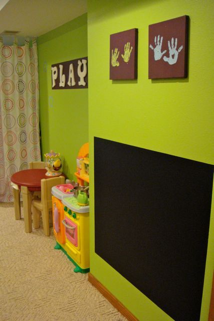

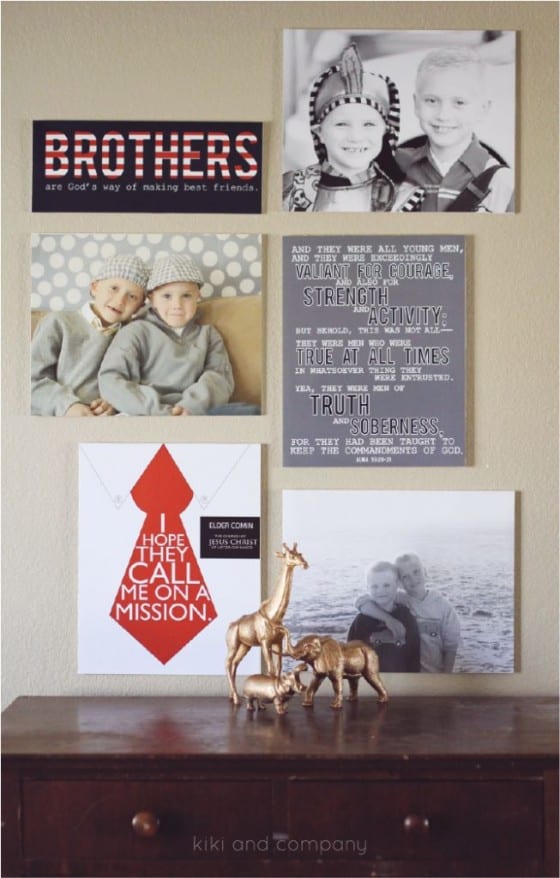

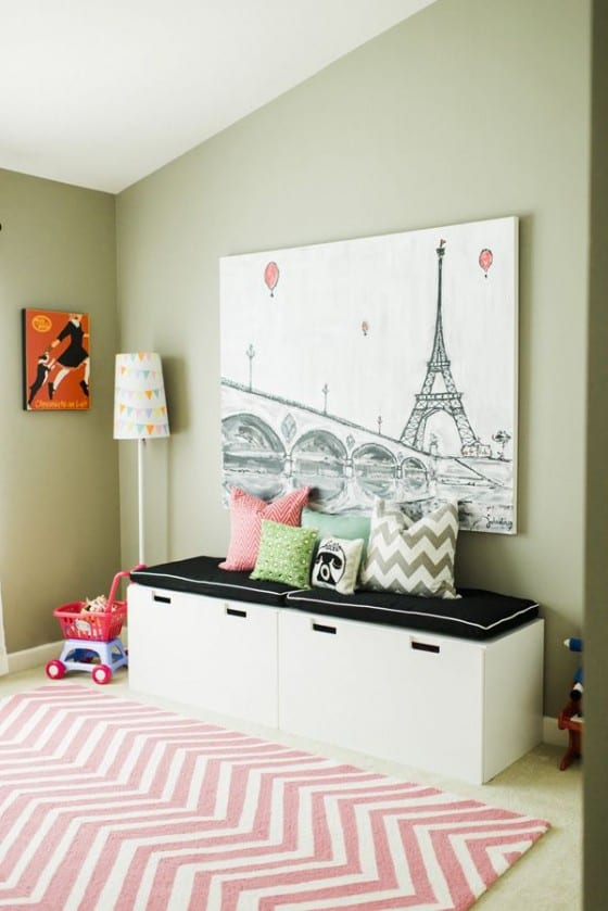
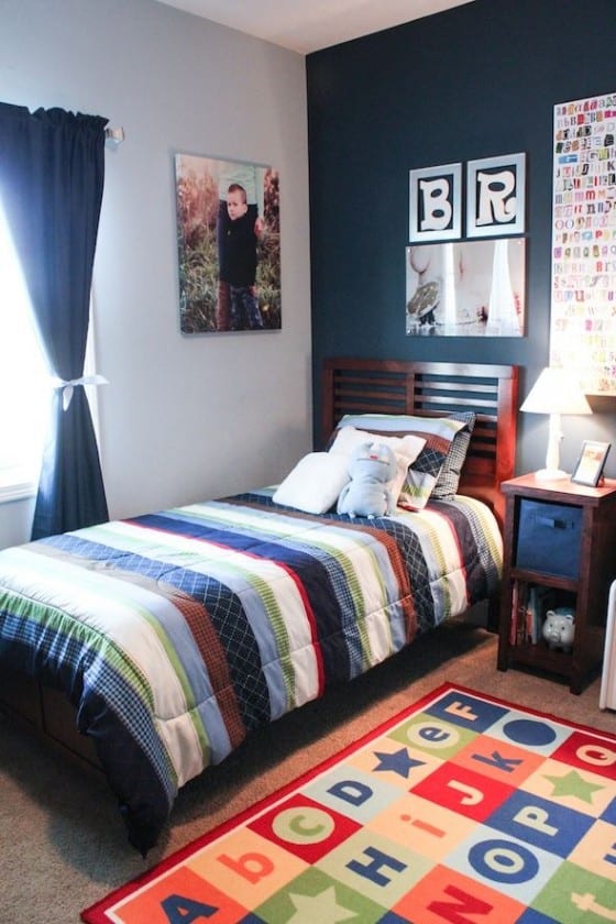
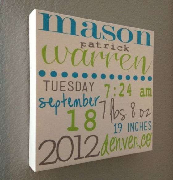

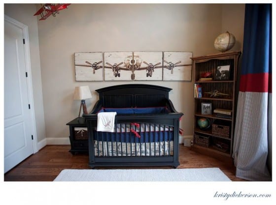
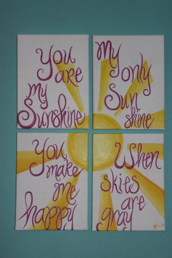


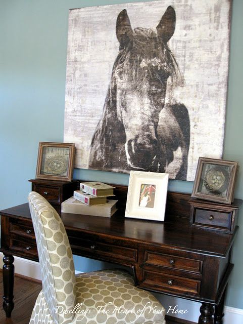
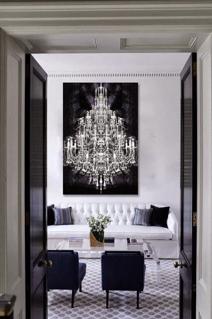
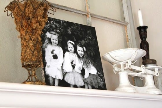
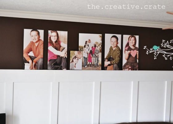

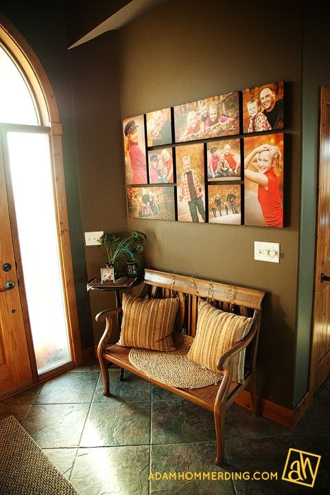
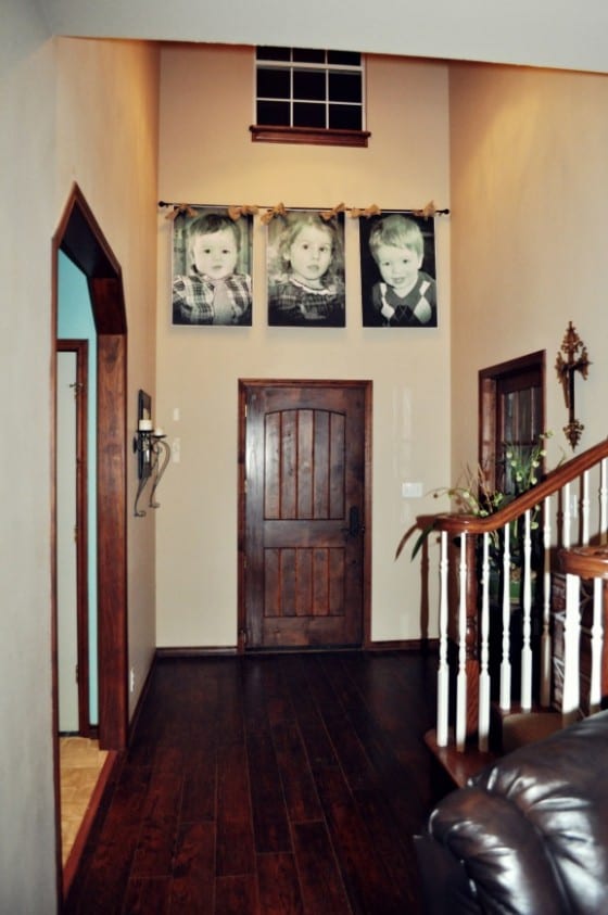
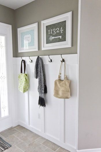
Entry & Hallway

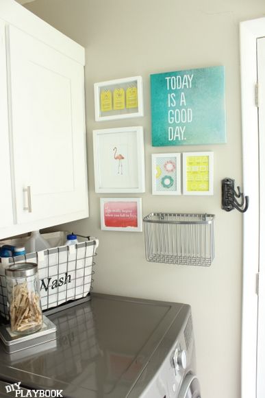

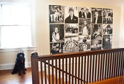
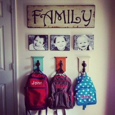
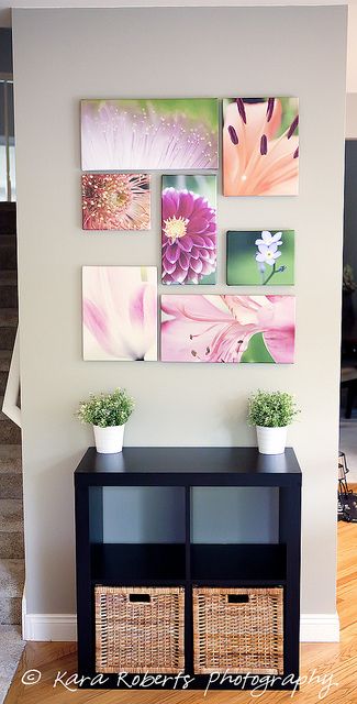
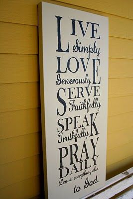
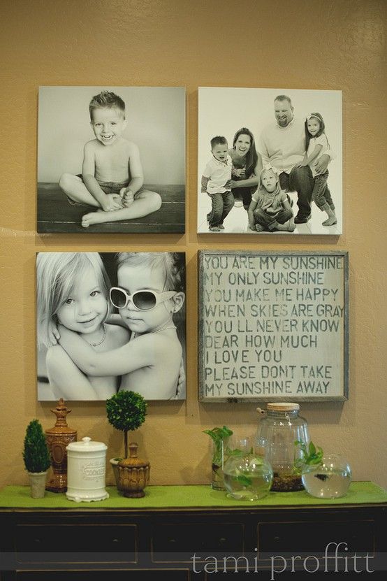
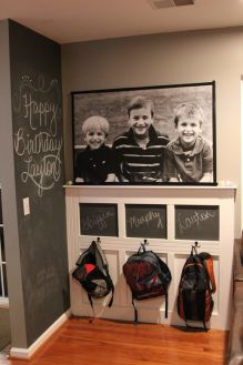
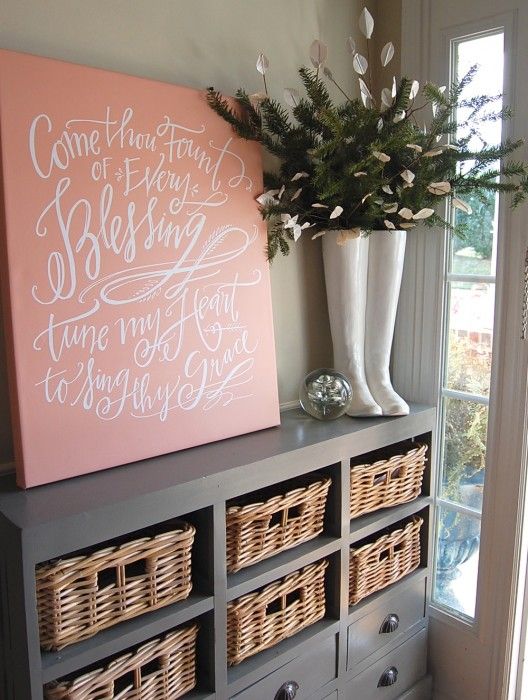
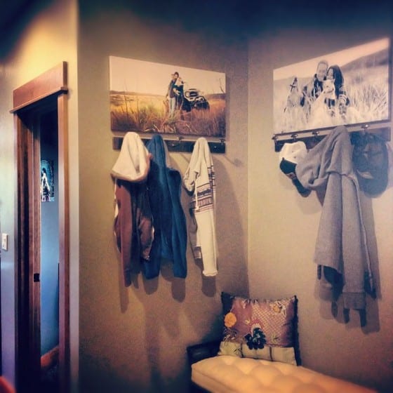
Kitchen
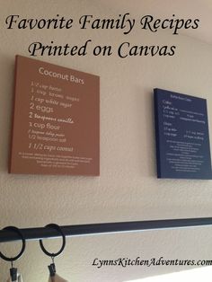
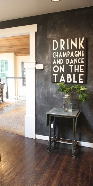
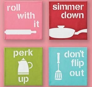
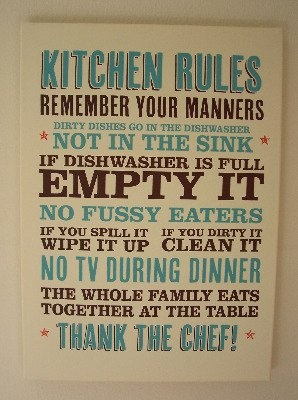
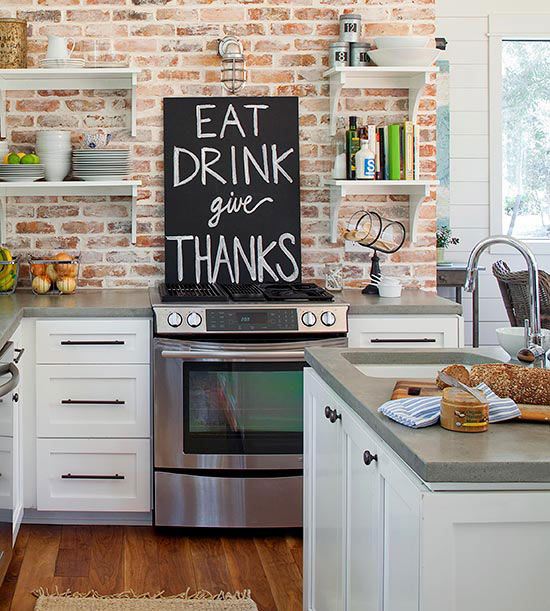
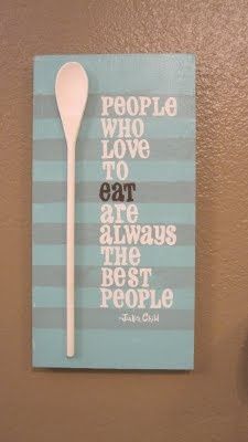
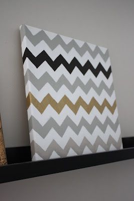
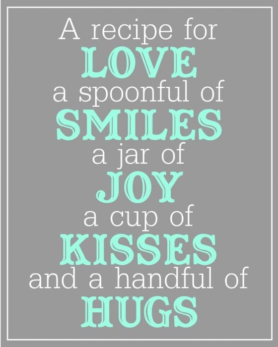
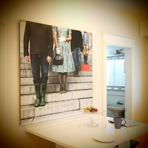
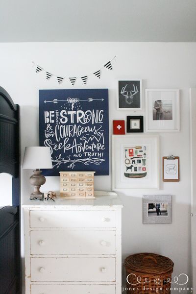
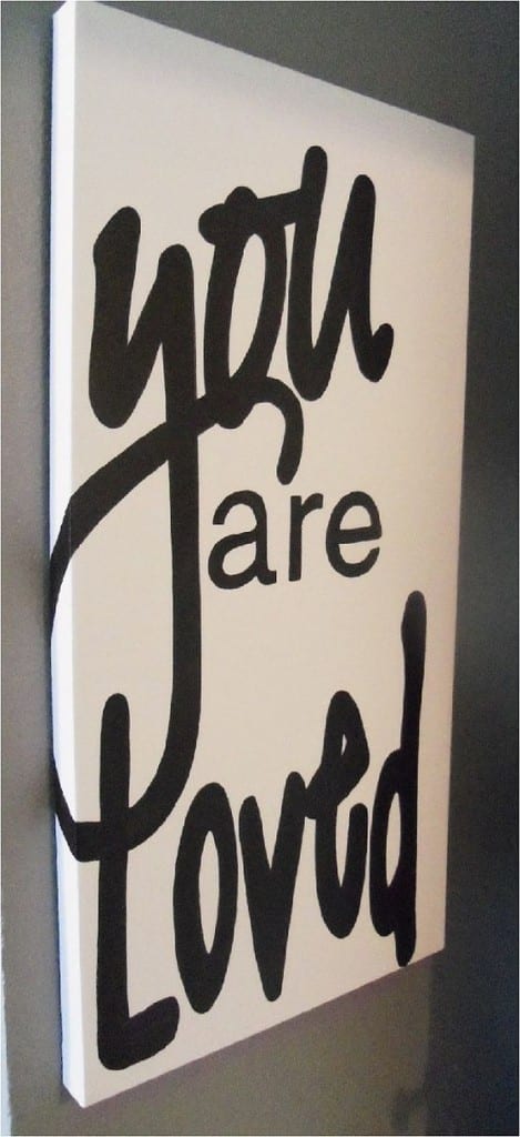

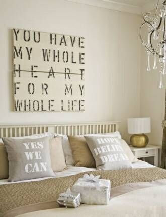
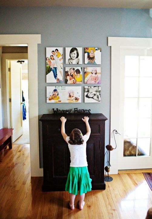
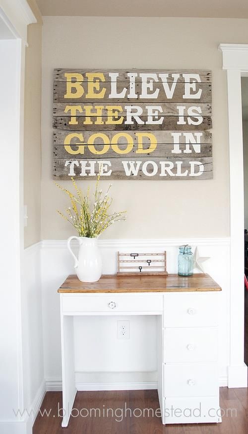
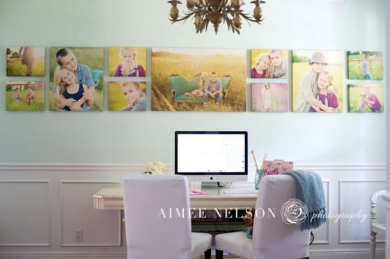
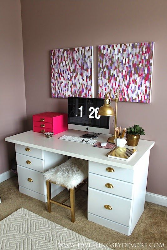
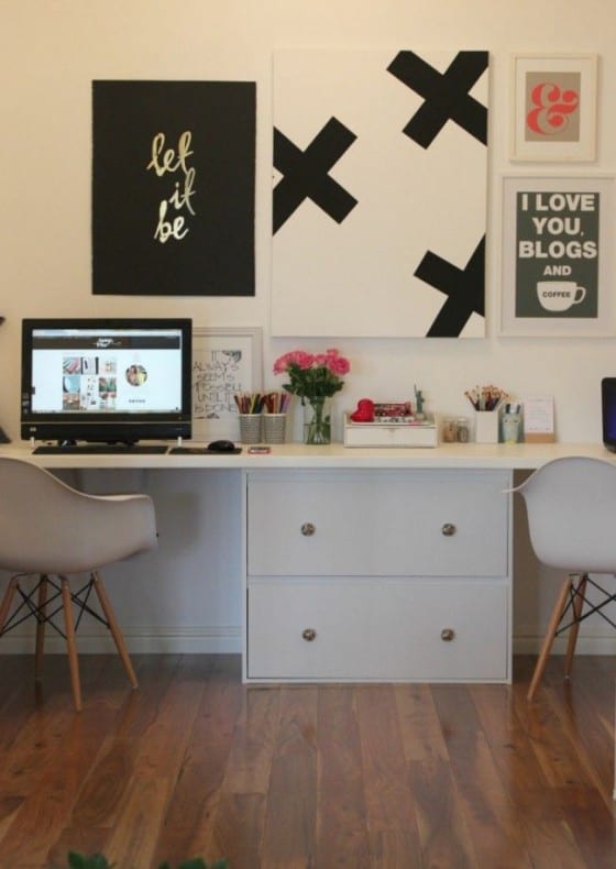
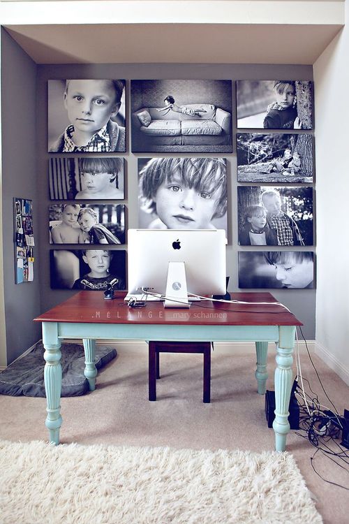
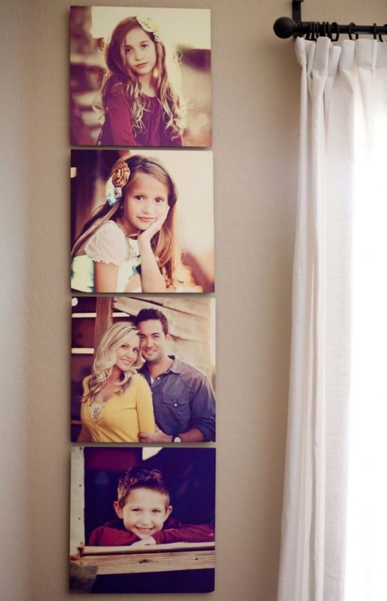
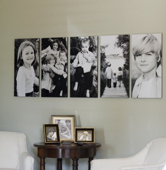
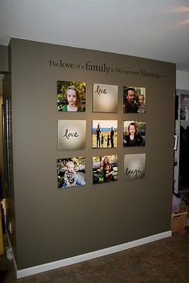
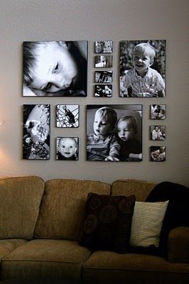
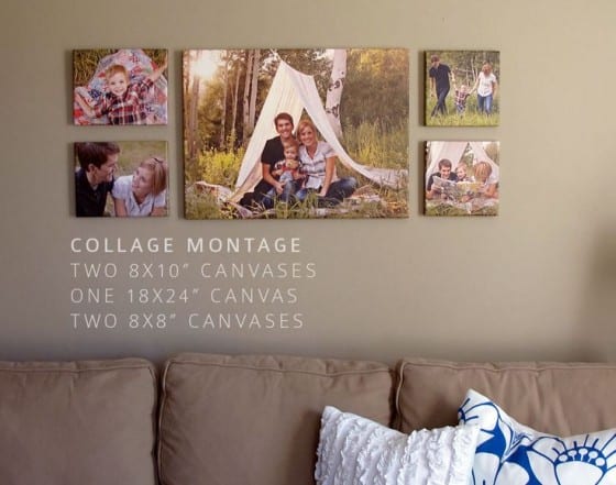

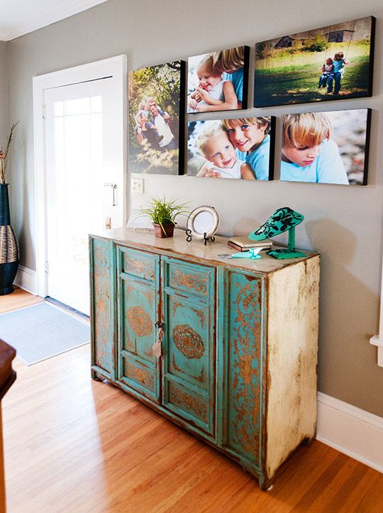
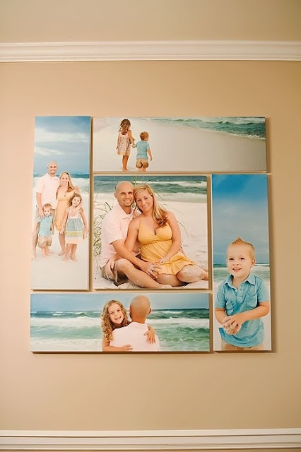
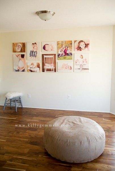
Baby/Newborn Canvas Print Ideas
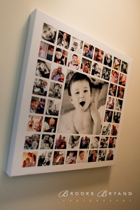

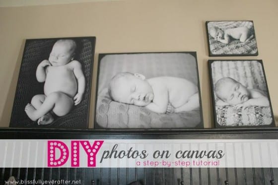
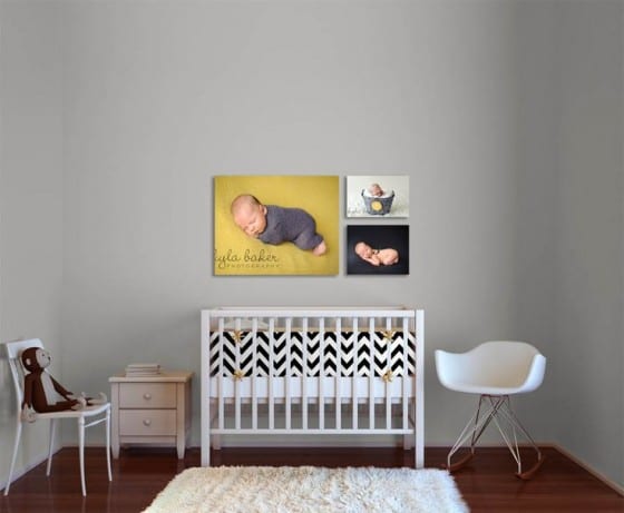
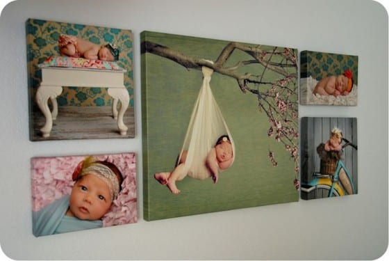
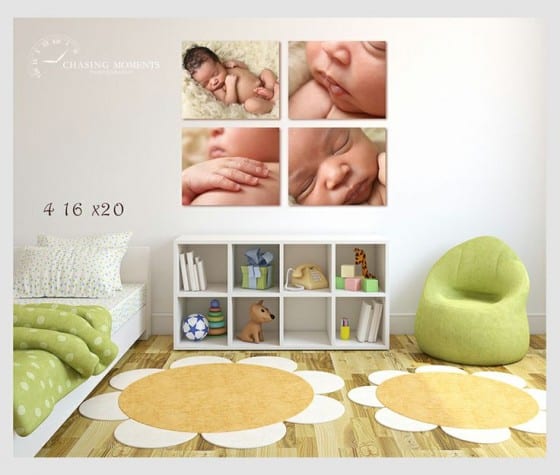
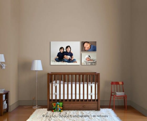
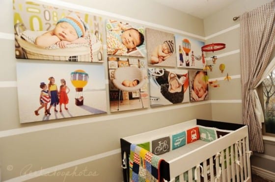
Creative Wedding & Engagement Canvas Print Ideas
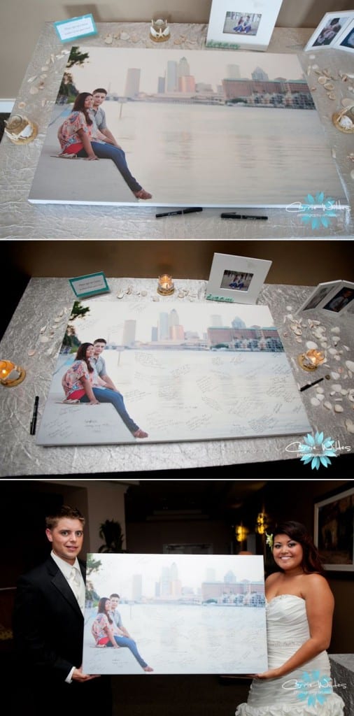
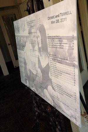
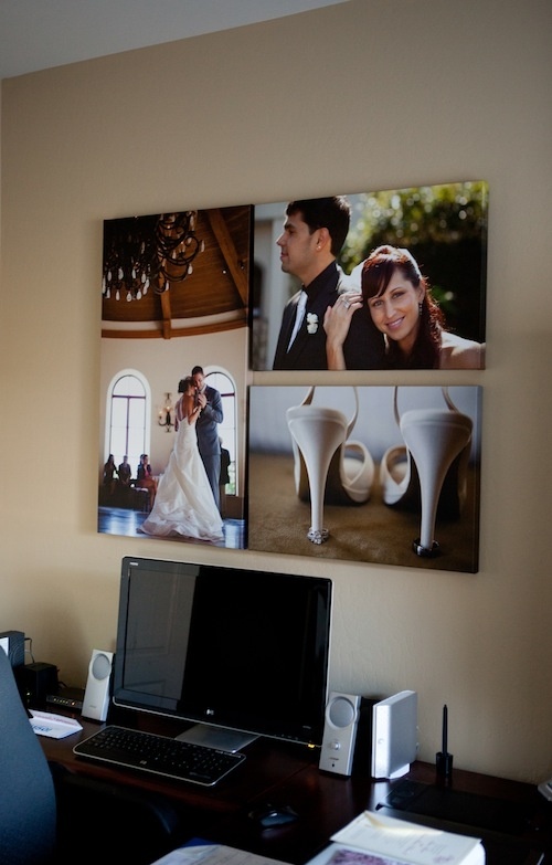
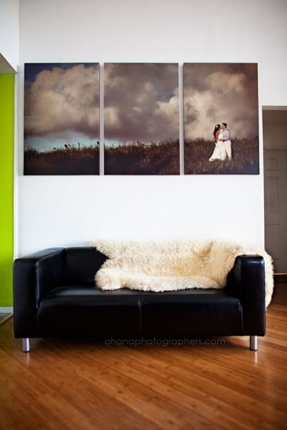

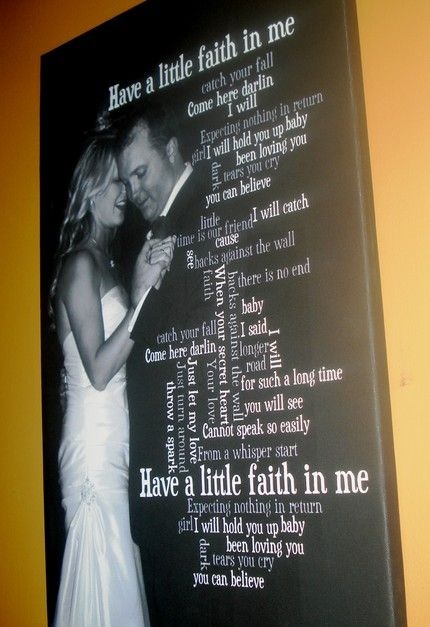


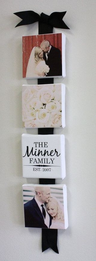
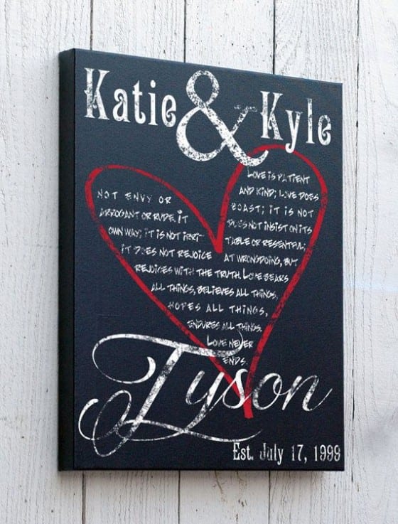
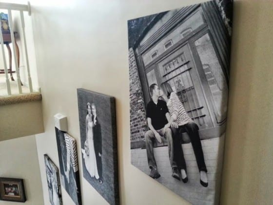
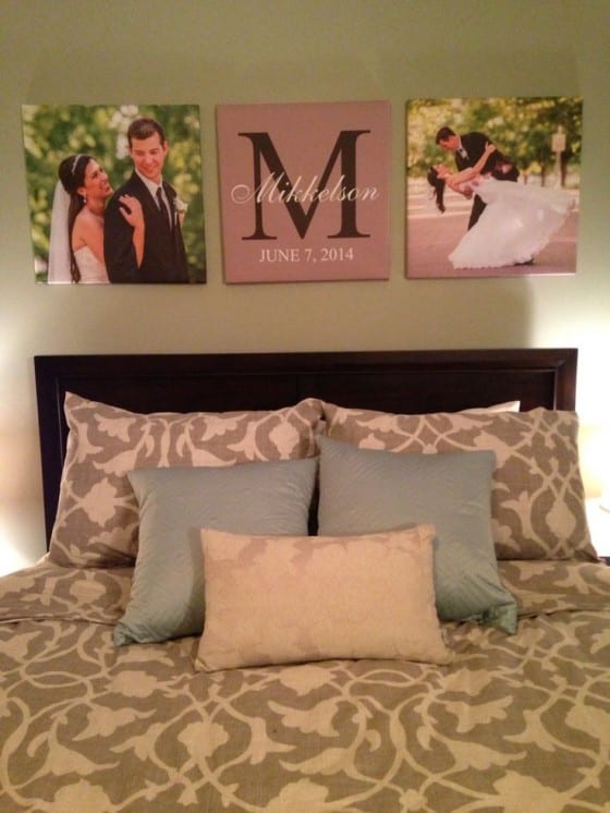
Asset Print offers excellent service and quality in canvas printing. Click here to order canvas printing online!
Posted on July 5th, 2018
BANNER WALL USES
Before looking at Banner Wall Uses, let’s start off with what a Banner Wall is – they are big, colourful and can certainly get your brand noticed no matter where you are putting it up. They are made out of high quality, portable backdrops that consist of an aluminium expandable frame and a polyester canvas.
Now moving on, let’s take a deeper look into how to effectively use banner walls.
- Opening Ceremonies
If you are looking to make a very good first impression and set the tone at your official opening, a Banner Wall is a great way to grab people’s attention, lure them in and give through information about your new business.
- Any sporting event
Banner Walls can be put to great use at any indoor or outdoor sports events if you are looking to create brand awareness and find new like-minded customers. It is a great opportunity especially if you are sponsoring the event in any kind of way.
- Markets
Fleet markets area huge attraction to most people in and around the area where it is taking place and if you are looking to get more customers to your stall, then a Banner Wall is going to give you a lot of benefits to reap from. It will attract the attention of everyone at the market which will intrigue them to come see what you are selling.
- Product Launches
People love being in the loop with new products, new technology and of course investing in them as well – if you are looking to give information in a simple, yet very effective way then you can’t go wrong with a Banner Wall – you can use it to inform people about features, what the product looks like and extra additional information.
- The mall
Thousands upon thousands of people go to the mall during weekdays, weekends and holidays – it is the one place where people can find almost everything and anything they want. If you have a special on and want to make it public and intriguing, there is no better way to do it than to get creative with a Banner Wall. By-passers will spot it almost immediately and are bound to convert into customers pretty soon.
- Photoshoots
Are you looking for a white or coloured background for your upcoming photoshoot? No need to look any further! Banner Walls serve as a great tool to use as a background and you can get them in any colour you need.

As you can see, there are many uses for banner walls that can not only benefit your company, but create brand awareness to new people and essentially grow your customers. All in all, this is not where Banner Wall Uses come to an end.
Asset Print offers some of the best banner walls Cape Town has to offer with quality and prices. Contact Asset Print today to get yours started and we can guarantee to exceed your expectations of our banner walls.
Article source: http://thedigitalprintshop.blogspot.co.za/2018/05/banner-wall-uses.html
Posted on May 18th, 2018
Are Vinyl Stickers Better Than Paper Stickers?
Vinyl stickers or paper stickers? A common debate when it comes to choosing what type of sticker to use. Is there a clear winner? Or is it really just down to preference? We compare our vinyl stickers against paper stickers. Read below as we look at both sides of the argument and we make our own judgment on the sticker debate.

Vinyl vs. paper
Vinyl has a lot of advantages over traditional paper stickers, which easily crack and fade over time. An advantage of vinyl is that it can be pulled off in one piece. Paper stickers are a nightmare to pull off after a while. Vinyl stickers won’t mark if water or oil is spilled on them. That’s a big plus. A paper sticker is ruined if any sort of liquid touches the sticker. The uses of paper stickers are limited. They are vulnerable to fading, prone to rip upon removal, and easily destroyed if wet. Paper stickers are mainly used for labels used indoors. They are typically printed in large rolls and applied to boxes and packaging. Vinyl stickers work for labels too but they have a whole lot more uses.

Vinyl is the clear winner
Vinyl is the clear winner when it comes to durability, look and feel. Vinyl stickers last longer, look better and stick to different surfaces better. We use only premium quality vinyl for our vinyl stickers at Asset Print. That’s why our products are incredibly long-lasting. We laminate vinyl stickers for outdoor use in a protective coating that is water, sun and oil-proof. It even makes the stickers scratch-resistant and keeps its colours vivid. They stay vivid with an outdoor life expectancy of up to seven years! Trust us comparing our vinyl stickers to paper stickers is like comparing your WiFi to dial-up. There’s just no contest!

Now it’s pretty obvious why vinyl stickers win against paper stickers. Go out and grab yourself some vinyl stickers!
Posted on April 24th, 2018
5 Tips for Effective Banner Marketing
Banner marketing can be a powerful way to promote your products and services to local customers, at trade shows, and at events. Teardrop banners stand out and get noticed; and large banner printing is cost-effective so you can reach hundreds or even thousands of potential customers for minimal investment. Use banners to fuel sales with the following five tips for effective banner marketing.
1. Feature a targeted message and promotion
Start by developing a targeted message or promotion for your banners. Consider who your customers are and what they want: how do you fulfill their desires, solve their problems, or otherwise make their lives better? This should be the foundation of your banner message. Be sure to define exactly what you want customers to do next: visit your website, call your number, or stop in at your brick-and-mortar location, for example. You should also tell customers why they should take your requested action immediately – you might offer a time-limited discount, for example. If your banner message reveals how customers can get what they want, why they need to get it now, and why they need to get it from you, you’re off to a great start.

2. Keep it simple and memorable
Keep your banners simple and memorable to maximize their effectiveness. That means short, bold headlines that command attention and stick in customers’ heads. Rhymes and humor can be effective tools that help customers recall your banner later. Keep in mind many people won’t give your banner more than a passing glance, either by necessity (when driving) or distraction (at an outdoor event, such as a concert). Thus, you have to make your banners visually compelling, simple, and memorable. Limit the amount of text on your banners so they can be read and understood at-a-glance. Make your call to action short, sweet, and memorable: you might even create a special URL or phone number that makes it easy for potential customers to remember how to follow up. Don’t overload your banners with information; if your banners can be digested in under two seconds and remembered two hours later, you’re on the right track.
3. Craft an attention-getting design
Your banners must feature an attention-getting design in order to get customers to read them; it stands to reason they have to be noticed before they can be understood and acted upon. Some ways to command attention with banner design include:
unique and unexpected images
large, bold headlines
contrasting colors
large dollar signs, percentage symbols, and “free" text
You don’t have to incorporate all of these into a single banner design; in many cases, simple text-based banners can be just as effective as banners that feature creative artwork.

Effective banner marketing requires intelligent, targeted placement. There are two ways to target banner placement, and both strategies can be effective: you can place banners to achieve the greatest possible views, or you can place banners to reach a well-defined audience. For the former, busy traffic intersections, shopping districts, and community events can help your banners reach hundreds or even thousands of people every day. Some of those people are likely customers, and so this strategy works. Let’s say you sell running shoes, so you print a banner promoting a special discount sale and place near a busy intersection. You can reasonably assume a lot of runners will drive by it every day, so your banner should send customers to you. For the latter, niche events, trade shows, and places customers frequent provide fewer views, but that’s offset by advanced targeted: your banners and teardrop banners are always in front of likely customers. If you sell running shoes, you might place banners at 5K races in which everyone is a potential customer. Since banners are relatively cheap to print, you can employ both strategies to maximize your reach with banner marketing.
 \
\5. Print quality banners at discount prices
Speaking of printing, it’s important to print your banners on quality vinyl, vinyl mesh, or canvas material with UV-resistant inks. Doing so not only increases their longevity, they make your banners look amazing – which in turn makes your brand appear trustworthy. Pick the right banner material for your distribution strategy, then print premium quality banners at discount prices to maximize your return on investment. Banner marketing isn’t rocket science, but it does require some thought in order to get the most bang for your buck. Apply these five tips to print effective teardrop banners and hanging banners that drive legions of customers to your business. Start your banner marketing campaign with Asset Print.
Posted on February 22nd, 2018
4 Ways to Improve Your Banner Ad Design
Improving banner ad design is crucial if you want to improve your click-through rate. Business Insider formulated some statistics about banner ads including that you’re more likely to survive a plane crash or give to birth twins than click on a banner ad. Poor banner ad design is often to blame for a poor click-through rate. If you improve banner ad design you can prove these statistics wrong, and achieve a higher click-through rate!
Most advertisers do not know how to optimize and improve their banner ads and therefore fail to achieve their campaign goals. However, you can easily get ahead in the game by following our 4 ways to improve your banner ad design.
1. Improve Banner Ad Design with a Defined Purpose

The design of your banner ad will improve quickly if you have defined its purpose. Think about the purpose of your banner ad: is its purpose to generate traffic to your site, to improve your conversions, build brand awareness, or all three?
For example, the WWF banner ad above shows an awareness campaign, with the purpose to make people aware of their campaign and their message. The photo used in the banner ad is unique and therefore eye-catching which is always a positive to avoid banner blindness. This banner ad has been clearly built with the intention to build awareness about cruelty towards animals and it manages to do this effectively.It is also clear from the lack of buttons to click on and the lack of text that WWF is not specifically aiming to generate site traffic or conversions.
On the other hand, the design of the banner ad below, also by WWF has a totally different purpose. By an eye-catching red call-to-action button on the right-hand side, it is clear that the focus of the banner ad design is conversions. It is also very clear that their goal here is to get people to come to the site to make regular donations, explained in the text.

2. Improve Design by Simplifying your Banner Ads

You can easily improve your banner ad design by optioning for a simple, clean layout that is easy on the eyes. The banner above is a good example of a common mistake that many designers make: too much information on one banner. As you can see, by having too much information in such a small area it becomes distracting and the core message becomes unclear to the viewer and therefore they do not know what they should do with what to expect if they click the banner ad.
The designers could easily improve the design of this banner ad by limiting the amount of text and by using whitespace effectively. By only featuring a few elements on the banner, the message that this banner ad is trying to express will be a lot clearer and viewers will not avoid clicking on the banner ad because it is unclear or looks suspicious.
Gillette’s banner ad is an example of simple banner ad design done well. They leave a lot of space and focus on the message the call-to-action with a powerful and contrasting colour. The location and colour of the button combined make it impossible to miss. Compared to the banner above, Gillette’s banner is much more easy to view. The design here is good, functional and easily achieved. It is clear that if you want to effectively reach out to new customers, that simple design is superior.

3. The importance of colours in banners

Colours make a big impact and you can improve your banner ad design by using the rights colours in the right way. Gregory Ciotti wrote a great article about Psychology of colours in marketing and branding, which gives an insight into how important it is and how you can benefit from it in your ad campaigns.
Different colours will make the audience of your banner ads feel different emotions. Therefore it is important to choose colours that represent your brand, but also make people feel things that fit with who you are and what your product or service is. That relation is actually more important than the colour itself.
Take a look at the Colour Emotion Guide above – does the related emotion of your banner ad colours fit with what you and your product stand for? By spending some time thinking about what message or emotion you are trying to convey to your view you can improve your banner ad design.
4. Improve Banner Ad Design with Better Copy
There are some points to keep in mind when writing your banner ad copy. As I mentioned earlier in this post, you always need to remember the goal and purpose of your ad. This also applies to the copywriting. What is the purpose and what is the message you are trying to convey?
According to Emilie Futterman’s post on The Next Web, it’s important to keep the copy simple and un-cluttered. Avoid flashing or flickering designs and instead go for a lean, limited and strong copy. Keep in mind that people don’t have much time so the less for them to read, the better.
Final Thoughts
We can see that it’s not necessary to make really big changes in order to improve your banner ad design. Even small changes are enough to make improvements and you will soon see results. It is also worth testing different designs back and forth and you will notice what works the best for you!
For expert assistance with designing and printing your banners - visit Asset Print today or view their printing products and services online.
Posted on January 18th, 2018
Valuable Tips For A More Powerful & Effective Vinyl Banner

Strong promotion is a key to success for any business. As a business owner, you need to get your name out there. Maybe there is a promotion you want to let your customers know about, and need to do it quickly and inexpensively. Or, you may have an event you need to promote right away. Well, there might not be a better tool than a vinyl banner to do the job. A new custom vinyl banner might be the most cost-efficient way to promote your name, your brand, and what you do. Sharp looking vinyl banners will not only help you easily market products and services to your customers but do so with style. A vinyl banner has the ability to draw people’s attention, especially vibrant full-color custom banners. In addition, vinyl banners are inexpensive to buy and are durable enough for long-term use. Here are a few great tips to help you get started with your custom banner today:
Planning Out Your Vinyl Banner
If you were to speak to a design consultant, they would ask several questions about you and your business to understand how you would want to design a new custom banner. In addition, a designer might ask you questions like:
What will your vinyl banner be used for?
How long do you need to hang your banner up for?
Will the banner be primarily indoors or outdoors?
What kind of logos or graphics do you plan to use for your custom banner?
You can think through these questions yourself to come up with ideas and answers. Remember that a little bit of planning goes a long way.
The Size of the Banner Counts
Obviously, the efficiency of any advertisement is affected by the size of the promotional display. This is no different for a vinyl banner. When choosing the size of your custom banner, you should consider its visibility. In most cases, the bigger the banner, the higher chance it has to attract consumers. However, you should also take into account the location where you will want to mount your vinyl banner. You will also want to take into consideration its distance from the readers. A good viewing distance provides good readability. You will want to make your banner only as large as your promotional materials will fit. This way, you will minimize any waste of resources. Finally, the banner should be big enough to display the message and grab people’s attention; thus, you should balance the size of your vinyl banner with the size of the font, image, and background colors.
Choosing the Right Vinyl Banner Material
You can choose from a wide variety of thicknesses for any kind of vinyl banner. However, it is important to take note that the thicker the vinyl you use, the more it will weigh. Extra options, such as a weather resistant coating, can make it even heavier. The thickness of a vinyl banner usually determines the weight per square foot. You need to take this into account, and consider where you will hang the banner. Make sure you can secure it properly to keep it from falling down, and that the location is secure enough to hold the weight of the custom banner.
Matte Versus Glossy
Most people don’t think of the difference between matte (not shiny) and glossy (shiny) banner materials. Matte and glossy banners each have different uses, and it is important to take note so you don’t order the wrong kind of banner. For example, matte banners are mostly used for outside display. In contrast, glossy vinyl banners are reserved for inside advertising, where the sun doesn’t glare off them as much. The chosen finish also has an effect on graphics or words that you would put on a banner. Brightly colored, sharp images do well on a matte vinyl banner. In contrast, some small objects and lower resolution graphics will look better on the glossy surface The choice of a matte or a vinyl banner depends on the intended use of the banner. In the end, it is up to you to determine if the high gloss shine of a glossy banner will help or hinder your design.
Hang Your Vinyl Banner With Care
You should also consider your finishing and hanging options for a new vinyl banner. These are items such as pole pockets and sewn-in ropes. These little extras are a big help and make it easier to properly mount or hang your banner properly. Vinyl banners with reinforced grommets around the edges also offer an quick and easy way to hang up a banner. You can easily have multiple banners printed at once to use them at multiple locations.
A Vinyl Banner Will Attract New Customers to Your Business
A banner from Asset Print is a great way to promote a business. As you can see, there are many factors to consider to create a successful custom banner for your business. An attractive design, the right size, a good focal point, a good hanging location, and a quality vinyl banner from a reputable company like Asset Print will go far to strongly influence and attract customers to your business.
Posted on November 28th, 2017
The Difference Between Vinyl Stickers and Vinyl Decals
At Vinyl Revolution, we specialise in making the best quality vinyl products possible. That’s why we want to make sure everyone can understand the differences between vinyl stickers and decals. It’s not rocket science. It’s just some simple vinyl science that everyone can wrap their heads around (excuse the pun – we just can’t help ourselves).
You might have heard the terms vinyl stickers and vinyl decals before and wondered what the difference is? It’s not surprising you might be confused. A lot of people seem to use the terms interchangeably. Or they think that hearing the word vinyl immediately means decal. But vinyl stickers and vinyl decals are very different and it’s important to understand the difference when buying online in our shop. You need to be sure you’re getting what you want!
What are vinyl decals?
Have a quick look at the products above. Do you notice any similarity between them? These are all vinyl decals. There’s a decal for a macbook, a vehicle and a wall. But the important thing is that they are all vinyl decals! You can get decals in lots of different colours and finishes but they are usually only in one single colour. Why? Because vinyl decals are physically cut from a roll of vinyl by a magical machine called a vinyl cutter or plotter. Here’s what our cutter looks like in our studio in Oxford.

The vinyl cutter is connected to a computer which allows it to read our vector design files. The cutter uses a single, tiny blade to cut into the vinyl .The big roll of vinyl is moved back and forth as the blade cuts into the material. Most importantly, the blade only cuts deep enough to slice through the vinyl material, not the backing paper it is stuck to. The result looks almost exactly as before. One big sheet of vinyl. But there’s an important difference! Look closely and you’ll see tons of tiny little lines cut into the material.
Once the vinyl has been cut it’s removed from the machine and laid on a table for weeding. Weeding is when the excess vinyl (the negative space in your decal) is removed by hand. This can be quite a time consuming process depending on the complexity of the design. Check out the video below for an example of what this looks like. Thankfully we can speed it up so you won’t be watching for hours!
Once the decal has been weeded, it’s ready for the taping machine. When the decal is pushed through the taping machine it rolls a layer of application tape onto the decal. This is what is then used to apply the decal to a surface. Voila! You’ve got yourself a vinyl decal.
Technically, you could make a vinyl decal with multiple colours. But to do this you’d have to cut each layer of vinyl separately and then do one of the following:
Combine all the layers onto a single piece of backing paper before taping them. This leaves you with only one layer to apply when it comes to sticking it to your surface.
Tape each layer separately. This means you then have to combine each layer separately when you try and stick it on your surface.
Weeding one vinyl decal is already quite a lot of work. Doing option 1 above is very time consuming to produce and would mean your decal would get very expensive. Doing option 2 above means you’d have to stick multiple layers on your surface, which can be a serious pain. While we do this sort of thing all the time for businesses that hire our professional services, we rarely include it in our products. Why? Because some customers already struggle with applying their decal. It can get a bit tricky with all the bits and pieces. Imagine trying to do multiple layers!
What are vinyl stickers?
Have a look at the products above. The similarity between these three stickers might be harder to notice than for the decals at the start of this post. But there is one thing they all have in common. Each of these vinyl stickers is printed onto vinyl using a wide-format printer. We load a roll of digital vinyl that absorbs the inks we use and keeps them looking great for ages. We use special repositionable vinyl for our stickers because it is much easier to apply and remove than other stickers while benefiting from all the long-lasting properties of vinyl. This is particularly important for wall stickers, when you don’t want to damage your wall upon removal. Here’s a photo of one of our printers in our studio in Oxford. Looks a little more complicated than the plotter doesn’t it?

You might wonder why the Alice Searching Behind the Curtains macbook sticker above is a vinyl sticker and not a decal. After all, it’s a single colour isn’t it? That’s absolutely right. The problem is that it’s a very complicated design. There’s no way you could get all the detail in the cross-hatching of that illustration in a small macbook decal. Our team would spend 10 hours to weed it and you would drive yourself crazy trying to keep all the little pieces on the application tape when you tried to stick it down. In cases where a single-colour design is too complicated to produce as a decal, we produce them as stickers that are printed onto transparent vinyl. The result is a product that looks a lot like a decal but has all the properties of a vinyl sticker.
Vinyl stickers can still have shapes cut out of them. In fact, most of our stickers have shapes cut out of them. They just look much better when stuck to your surface like that. We actually die-cut all of our stickers to make them look even better. That means that after your sticker is printed onto the roll of vinyl, the same machine goes back and cuts a contour for each sticker into the role. This cutting process is exactly the same as for decals with one important difference: the blade is set to cut all the way through the vinyl and backing paper (rather than just the vinyl). This creates a die-cut sticker that we pop out of the big vinyl roll and quality control before preparing it to be sent anywhere in the world.
You’re now officially a vinyl wizard
Ok. Maybe not quite a vinyl wizard. The vinyl wizards in our studio have been honing their craft for years to learn the best way to weed a decal and create design files for die-cut stickers. Their experience helps us to make the best vinyl stickers and decals around.
Wait a minute. Did you just understand all the terms in those last sentences? If you did than you just might be on your way to becoming a true wizard. Welcome to the club. Now use your newfound knowledge to impress your friends. Or head to our online shop and buy something knowing exactly what to expect. Want your own custom decal or sticker?
Contact a good, experienced vinyl sticker printing company in your area, such as Asset Print.
Article source: https://www.vinylrevolution.co.uk/blog/how-to/the-difference-between-vinyl-stickers-and-vinyl-decals
Posted on September 21st, 2017
BUSINESS CARD DESIGN AND BUSINESS CARD PRINTING TIPS
Your business card design and business card printing should never be a side thought to your marketing plan, it often works as the first point of contact between a potential customer and your company. It needs to be strategically thought out and designed in a way that encourages them to want to know more about you and your service offerings.
If you want to create eye-catching, distinctive and professional business cards it is important to work alongside a professional business card designer and business card printing company, take a look at these top tips for business card success:
THE 4 W’S
Who? What? Where? Why? You may want to roll your eyes at how obvious this is but it certainly has to be mentioned because it is the most important part of your business card! This is the key information that you want to convey to your audience. Ensure that your name, company name, logo, job title and contact information is clearly displayed on your card.

Think carefully about which contact details you would like to give out as you need to strike a good balance between offering enough point of contacts without looking too cluttered. With years of experience in business card design and business card printing, we suggest you include: your email address, work number and website address.
TYPOGRAPHY FOR READABILITY
Don’t be tempted to minimise the size of your text because you want to add more information. Rather leave out some of the unnecessary details to ensure a readable business card. A smaller font may look perfectly acceptable when you look at the design on a screen, but your business card will be printed!

The general rule is to not go smaller than 8pt. Another aspect to look at is the typography itself. What font are you going to use? Keep it simple and easy to read – your business card is no place for calligraphy or the dreaded Comic Sans typeface. In fact, Comic Sans has no place anywhere…
BLACK AND WHITE OR COLOUR BUSINESS CARD PRINTING
Colours certainly give your business card an eye-catching advantage over a typical black and white print. If you are going for colour, make sure you only use colours that are in-line with your corporate branding. Again, this may sound obvious, but it is critical.
However, brightly coloured cards should only be used by businesses that embrace a creative company culture. It would make sense for a digital agency put together an eye catching colourful design, but would it be applicable to a legal firm? Probably not.

In the same breath, never underestimate the power of simplicity.

A simple black and white business card is often viewed as classy, professional, minimalist and stylish. To create this classic look, it is important that you work alongside an experienced graphic designer and printing company – this is not something you can design in Word.
EMBOSS LIKE A BOSS
If you are worried that your plain black and white design may appear too static, look into creating a fun, raised 3D effect. This is done by embossing your cards. If your business embraces style, class and elegance, than this is an excellent design choice for you.

Not only is an embossed card aesthetically appealing, it also makes it more tactile and engaging. The more engaging your marketing material, the more your potential clients will remember your business.
KEEP IT VISUAL
A picture is worth a thousand words. As we mentioned previously, you should never fill your business card with unnecessary information – it needs to get straight to the point. Yes, you need to have some text on your card but you don’t want to overwhelm the viewer.

Leave some space for something visually appealing i.e.: An image of your product or something related to your business. Think about placing this on the back of your business card, this is also a great space to boldly display your logo.
PAPER CHOICE
It is important to consider the thickness of your business card. Stronger, thicker and more durable cards feel more expensive and professional, while thinner paper makes them feel cheap and somewhat tacky. Think about your card as your handshake – it should be strong and firm.

Plus, you don’t want your business card to rip apart when it is placed in a potential client’s wallet…
ASSET PRINT: PRINTING COMPANY SOUTH AFRICA
As a leading printing company South Africa, Print Asset offers the highest quality business card design and business card printing solutions. Take a look at our business card promotions here and contact Asset Print for more information.
Time to get networking!
Posted on July 31st, 2017


