

Flyer design: 50 brilliant examples you can learn from
Maybe you’re a business owner and you don’t want your marketing efforts to end up in the recycling bin. Or maybe you need to advertise an event or fundraiser for your club or community organization. Whatever your needs, check out 50 stellar examples below with design tips that will get you inspired for your next flyer design project. And when you’re all ready to design your own printed flyers, contact Asset Print for great flyer designs and printing offers.
Want more flyer inspiration? Then check out our round up of 20 bold, minimalist flyers – or if you prefer a louder style, get inspired by 20 vibrant flyer designs.
01. Embrace Color
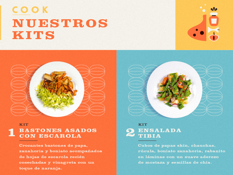
Bright, bold color palettes really give flyers punch and attract attention, even from across a room. This flyer design by Martin Azambuja uses vibrant hues that reflect the fresh ingredients of the dishes the flyer is advertising.
Combining different font styles and sizes can give your flyer a distinct look and help it stand out. In this piece from Overloaded Design, 3D effects on the text and some subtle, grungy textures also make the design pop.

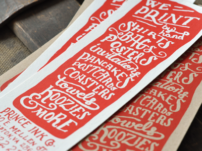
The handcrafted look is big right now (whether designs really are handmade or are just created to look like it). This screen-printed flyer from The Prince Ink Co. features whimsical, hand-drawn typography, which is very appropriate for a print company that runs all its prints by hand. Using a "form equals content" approach to design like this can be very effective.

Like patterns, shapes are a great attention-getter, especially when applied creatively. This flyer design by Justin Krout uses shape in both the text and the graphics. Notice how the tilting shape of the text makes for a unique and eye-catching title, while the mountain below is made up of triangles of all shapes and sizes, creating a multifaceted, almost 3D effect.

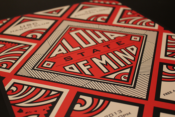
Finely detailed graphics can be stunning, but how do you avoid making your design look too busy? A limited color palette helps, as does a focus on symmetry and balance, like in this flyer design by Kristie Kam. This flyer also keeps things polished by sticking to a visual theme — in this case, a heavy emphasis on geometric shapes and patterns.
Choosing a cohesive color scheme (maybe the colors in your company’s logo) and/or staying in the same color family or temperature (warm or cool) really pulls your flyer design together. This folding flyer by Evan Travelstead sticks to cool blues and grays against bright white for a clean, polished look.
Paying close attention to spacing and alignment is an important step in the design process — one that can make or break a project. See how in this flyer by Pashlov Egor, all the icons in red are approximately the same distance apart? Though there’s a lot going on, everything fits together nicely, almost like puzzle pieces, without looking crowded.

When’s the last time you saw coupons with hand-drawn illustrations? Giving your design that extra personal touch, like Mel Larsen did in this flyer, will be sure to catch the attention of your viewers and give them a good impression of your brand or organization.

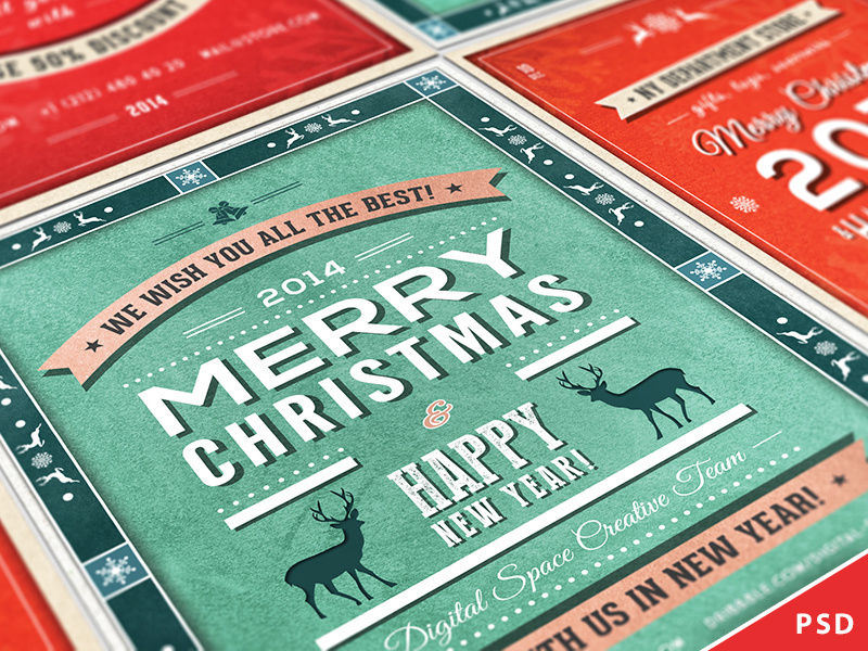
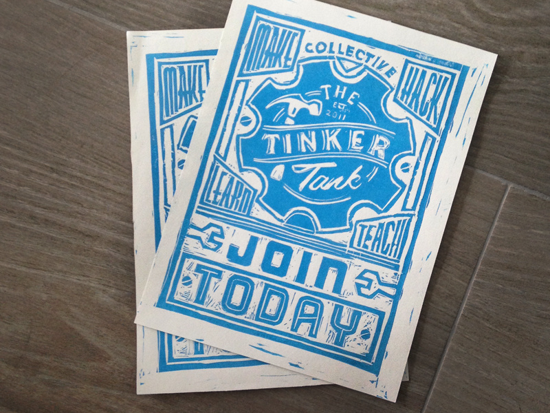
Designs that are textured or a little rough around the edges can be a nice contrast to all those more slickly produced flyers out there. As with this hand-carved block print by Jack Daniel Bagdadi, sometimes designs (much like people) are all the more appealing and dynamic for their little imperfections.
Take a page from art class and use the concept of leading lines. A common composition trick in art and photography, leading lines are just what they sound like — they lead in to the part of the image that the artist wants viewers to focus on. In this design by Macrochromatic, the diagonal lines of the mountains intersect with the sides of the red triangles to form arrows that point right at the band’s name.
Stay tuned for Part 2...
