Print Perfection

Print Perfection

10 Flyer Design Tips To Boost Your Marketing Campaigns

Flyersare a great way to advertise your business. Remember, the most effective marketing is simple, affordable and trustworthy - flyersare exactly that. A strong flyer design will be beautiful, memorable and thought-provoking. The simple beauty of it is that you can reach out and touch it. It engages us on a physical level. This helps to create a lasting connection with the consumer, making flyers an effective way of promoting your business. Blending solid craftsmanship, intelligent design and compelling storytelling, effective flyer designs will engage and inspire people. Whether you hire a graphic designer, or do it yourself, design is key to ensuring a solid return on investment. In this guide, we take you through ten flyer design tips to help you create the perfect flyer to boost your business.

Function Over Form

Your flyer should be functional, easy to read and clear
Although your flyer needs to be eye-catching, aesthetically pleasing and memorable, we’ll come to the design side later. First and foremost, your flyer must be functional. You’re not Michelangelo painting the Sistine Chapel; you’re a business trying to sell a product. You need to make sure your marketing is concise, readable, and clear. Ensure that the flyer looks professional, and meets the basic requirements; it should have the correct print resolution and it should show an awareness of current print marketing trends – otherwise it may make your business look amateur. Ensure that the information on your flyer is easy to read and presented without visual clutter. Even a flyer that’s creative and unique must meet these basic criteria. Remember, effective marketing is about effective communication. A flyer-reader has little time and little attention-span. Keep it concise and to the point. Make essential information (e.g. contact details) easily accessible; try using a bold color, or blowing the font up to a large-scale. Try and adopt a conversational tone that will draw people in, and make them keep reading. If you’re selling a specific product, show an image of it. It might seem simple, but people buy with their eyes. Give the reader something visual and your flyer will convert to sales much more effectively.

Know Your Audience

Understanding who your target audience is will make it much easier to find the right design
As with any effective marketing, you need to know who you’re trying to reach with your flyer. Who’s your target demographic? What are their likes and dislikes, their interests and their tastes? How do they speak? What do they relate to? And what’s going to catch their attention? Do your market research first, and then construct the ideal flyer with your target reader in mind. When you’re figuring out the tone of your text you need to keep in mind the type of person who you hope will be reading it. If you are trying to tap into a new market, the flyer should be catchy and enticing, not overly pushy. If you are consolidating an existing group of customers or clients, try to strike a tone that suggests a sense of friendship, trust and personal connection. Always use direct pronouns like "you" and "your" rather than generalized words like "we" or "our’ – this will make your flyer speak directly to the reader, and grab their attention, letting the consumer know that they come first. If you’re able to reach your target audience, your flyers will be 100% more effective.

Use Space Effectively

Flyers are small, but that doesn’t mean you should try to put as much information on it as possible
One of the defining features of flyers is that they are small. Most flyers are restricted to a standard 5.5" x 8.5" or 4" x 6" page size, so you will always be faced with very limited print space. With this in mind, you’re going to need to think creatively about how to lay out your design, in order to get across your key information. Much like designing posters, flyers need to use space carefully. A great technique to create more space is to gridify – that is to divide the page into a grid, with each square containing a different patch of text, an image or a logo. With a word document, or even a more formal brochure, you might expect to arrange text content into a single column on the page. However, with a flyer you should aim to be more experimental with your use of space. Think along the grid. That said, dividing your flyer up into perfect squares can look overly rigid and functional. Try using irregular sized sections to really make your content pop off the page. You could have one large square of text, next to an image, with a small square of text underneath. Or if you’re looking to really shake things up, why not try experimenting with diagonal compositions? There’s really no end to the possibilities of your design, just make sure you use space effectively. Don’t let your flyer get crowded or messy. The ideal design packs in loads of content, but still looks minimal, clean and balanced.

Be Eye-Catching

A striking visual image can really grab the attention of your potential customers
One of the most important flyer design tips is to produce one that grabs people’s attention and creates a strong visual impact. The more eye-catching your flyer, the more likely a person is to pick up or hold onto your flyer. Whether you’re going for subtlety or boldness, you certainly want to avoid the curse of dullness at all costs. Understated and professional designs can be completely transformed from banal to brilliant with a deft attention to color. Use your business colors to reinforce your brand, and make sure you use a balanced palette. If you’re advertising an event, or a product that’s more attention-seeking, such as a club night, exhibition or festival, you simply can’t afford not to be eye-catching! You want to imbue your flyer with the spirit of the product itself. Receiving your flyer should be an experience, transporting the reader to the event you’re offering and allowing them to imagine what it would be like as an experience. The most eye-catching flyers use color effectively; a palette of complementary and bold tones will make your content jump off the page. Try to balance a trio of bold elements – one striking visual image, one attention-grabbing headline (in a legible but bold font) and one colored element (such as a logo). By sticking to this three-element rule, you can avoid overcrowding, and ensure your flyer remains easy on the eye. Most importantly, make sure your design is fun and optimistic. It shouldn’t feel overly serious; even if it’s corporate. Your main aim is to make a flyer that people will hold on to. They’re far more likely to do this if the design makes them feel good.

Be Cool

By using a minimal design, your flyer will appear more professional
Attention-grabbing doesn’t mean noisy, pushy or needy. A flyer can be eye-catching and enticing even if it’s understated. Sometimes a more subtle flyer design can be perfectly-pitched, especially if you’re targeting a more demure, intelligent or corporate consumer. Aim for an aesthetic that is minimal, serene and calm. Remember less is more, and sometimes it’s effective to play hard to get. If you’re advertising a corporate service or a product with a sophisticated image, your flyer should reflect that. An effective marketing strategy can be one that says "We’ve got this great thing going on, you need to come to us in order to get it." Now imagine that message in flyer form; a flat, understated design style will attract your target consumer with very little effort. Try keeping it simple. Use a black, white and grey palette, and restrict yourself to a careful use of color; one splash of bold color is enough. Teals, mint greens, silvers, mustards, and lilacs are innately engaging and deftly corporate. You don’t want to seem like you’re trying too hard to impress, so remember, be cool.

Be Friendly

Adding a picture of your smiling employees can make your flyer seem more friendly
Being understated shouldn’t be conflated with being aloof. You want your flyer to make your company seem charming, friendly and approachable, and there are a number of ways of achieving that. First, strike an informal, conversational tone with your text. Second, choose images that make a good impression. Don’t underestimate the power of a smiling human face when it comes to making people feel at ease. Imagine a university prospectus, corporate brochure, or a shampoo advert; they’re full of people smiling. Especially if you’re marketing a service, it’s super important to present the viewer with a friendly face. Imagine how you would greet a client in your office, then put that face on your flyer. When they interact with your company down the line, they will keep the image of that smile in their mind, making them feel at ease. A word of warning would be to avoid using stock images on flyers (unless you’re forced to by budgetary constraints). Many stock photos of "smiling business people" actually look soulless, forced and overly staged. Hiring a professional photographer might be expensive, but it’s worth it to ensure authenticity. Moreover, once you have an image that’s truly yours, you can use it across your marketing channels, on websites and social media, to create a lasting brand image.

Font

Your font needs to match your brand. For creating trust, try using more serious fonts.
One of the most often overlooked flyer design tips is to choose your font carefully. Different fonts have personalities of their own, and you need to match your font’s tone to your brand image. For example, if you’re trying to look professional, don’t use Comic Sans. That font is good for children’s entertainers, crayons, and comic books – but it’s not so good for corporate events, products or services. If you’re wondering what font to use, check out our blog post on typography trends. It’s usually safe to fall back on a sophisticated font – something like Helvetica or Times New Roman. But make sure you find a font that’s aesthetic, legible and clean. It doesn’t have to be unusual. As a general rule, we’d recommended that you limit the use of different fonts in your flyer design. Two font families is the maximum; one is usually enough. Add too many different fonts and your design will start to look cluttered and confused, losing its visual coherency. Less is more in this regard. If you’re looking for visual variety within your design, swap between bold, italic and regular versions of the same font. This is a great way to add emphasis and heterogeneity, without sacrificing consistency.

Use Color to Create Mood

Sometimes less is more. Stand out by using a single color.
As we’ve mentioned, color plays a vital role in making your flyer appear bolder and more appealing, but did you know it can also affect mood? Color, arguably more so than font choice or images, is the most significant feature in creating the mood and personality of your flyer design. In fact, color psychologyis crucial in enticing someone to pick up / hold on to your flyer, so your choice of color can make or break a good design. Color experts Pantone have released their color trends for 2018, which is a great guide when trying to establish your palette. According to Pantone executive Leatrice Eiseman, if you want to look "resourceful", your best of using blues and oranges; it’s a color combination that "combines warm and cool tones that you can’t avoid looking at". Yellow is "playful", pink is "discrete", and gold is "sophisticated". If you’re hoping to reach a diverse crowd, go with rosy tones; "this palette reaches out and embraces many different cultures". Choosing a poorly judged color combination can alienate consumers, but the right palette will help your flyer to convert into sales. If you’re looking for a classic, tried and tested color combination, use pastel colors; they are a natural application of our lifestyles and thought processes. Choose your color carefully, and you’ll be in control of your mood.

Connect to Digital

Use QR codes, coupons or tools like GizThis to connect your flyers to the digital world
Print should not be seen as the enemy of digital marketing. In fact, quite the opposite – it’s a strategy to increase sales through digital engagement. The most effective marketing campaigns are those in which your print and digital media are carefully coordinated, such that they reinforce one another, and mutually develop a consistent brand image. Printed flyers are a great way to drive your audience back online, and make them engage with your digital content. When designing your flyer, remember to include Facebook and Twitter links, so as to promote your social media presence. If you want to be really tech savvy, take this one step further using a tool like GizThis for iOS or Android, or digital coupons. That way your flyer can link to all kinds of exclusive content: personalized videos, free downloads, free WiFi, online discounts, voucher codes, games, maps, surveys and websites. Imagine the experience your consumer will go through: one minute they’re holding a simple, tactile flyer, the next they’re exploring a virtual world of endless possibilities. GizThisis also a great way of tracking the return on investment (ROI) of flyers. In the past, it was impossible to measure the success of flyers quantifiably, but by tracking consumer engagement through GizThis, suddenly you gain access to a whole heap of market information that’s incredibly useful in assessing the effectiveness of your marketing campaign. Connecting your flyer to your digital content is an essential part of your design.

Call to Action

Add a call-to-action to convert readers into customers
Perhaps one of the most basic but essential flyer design tips is to remember that you’re not handing out flyers for no reason. You’re handing them out because you want something in return. In order to get something from your customers, you need a ‘call to action’. This can be a command, imperative or directive that influences the reader to not only take the information on board, but to act on it. Remember, a flyer means nothing if it doesn’t inspire your audience to act. Questions, temptations and suggestions are all ways of subtly asking someone to engage. A classic call to action is the phrase "order now", or "why not go online?". You should aim to direct your customer towards a very specific action, and encourage them to act immediately. As such, incentives and discounts are generally helpful in enticing people to engage. Think about using more question marks, and get creative when it comes to slogans and phrases. Be bold, but keep it innocuous. People don’t like being told what to do, so you need to make them want to act – above all, your flyer design should be so enticing that they feel they can’t afford not to.

Conclusion

A well-designed and quality printed flyer, by Asset Print is a truly effective way to promote your business. By following our flyer design tips and combining well-made flyers with efficient street teams, on ground marketing campaigns, and a carefully coordinated digital presence, you could reach whole new audiences, as well as consolidating existing ones. Remember that first and foremost, every flyer design needs to prioritize functionality; if it reads clearly, and packs in the content, then you’re off to a good start. After that, design is everything – choose your colors carefully, balance your composition, and keep it minimal. The most successful flyers are the most enticing. The longer the viewer holds it in their hand, the more lasting and meaningful the impression. By creating beautiful designs, and using flyering as part of a considered marketing campaign, the possibilities for promotion are endless.

Article source: https://printingcapetown.wordpress.com/2019/09/29/10-flyer-design-tips-to-boost-your-marketing-campaigns/

Label Design and Packaging Trends for 2019


If your brand has spent the past few years employing an unchanging label design, it may be time to consider the new packaging trends that have sprung up and make 2019 the year for a visual makeover. Even if you have committed to a redesign relatively recently, it's worth determining the overall direction of the packaging space. Cutting-edge concepts could help your products stand out on store shelves, winning over shoppers in the new year.
The following are four labeling trends worth noting and potentially using in 2019:

1. Sustainability will sell: According to branding firm Jam&Co, consumers are interested in reducing their waste. Companies that employ recycled materials in their labels, or focus on packages that can be reused will have an advantage in perception over brands that are more wasteful. The design firm emphasized that even a small change such as using thinner materials or otherwise making packages smaller can have a positive connotation in the present, earth-friendly era.

2. Dual-tone simplicity has potential: As creative network 99 Designs pointed out, brands are using simplified visual palates to make shoppers take an interest in their products. This may mean draining the color from labels and employing just black and white. The striking contrast between those two hues creates a "powerful and incredibly versatile dialogue," according to 99 Designs. On crowded shelves, brands can stand out by cutting out all extraneous design elements and making this elegant combination work for them.

3. Packages may tie in with influencer marketing: Since labeling is a type of advertising, it makes sense for your brand to consider how your packages fit into your overall ad strategy. Jam&Co reported that with influencer marketing on the rise, companies can and should consider how their products will look when featured in photos and videos posted by popular personalities. Today's labels should look great during a filmed unboxing.

4. Companies will look backwards: When your brand is looking for design inspiration, it may pay to look back a few decades. Vintage looks are fashionable, and 99 Designs reported this trend will continue in 2019. People who want authenticity in the products they buy are attracted to labels that look and feel old fashioned, which may influence your choice of font, imagery, material and finish.

Label packaging design in 2019 will remain an essential part of overall marketing, and one worth focusing on. Working with a specialized printing partner such as Asset Print for your business label printing can give your brand a boost to to excel through the year with confidence.


Article source: https://www.lightninglabels.com/blog/label-design-packaging-trends-2019/

Gallery Walls: Tips To Get You Started


It’s a design dilemma — how to make a feature of a wall now feature walls have fallen out of favour? Artfully hang some pictures on it and call it a gallery wall.


A gallery wall designed by Elicyon interior design studio for the Chilterns Place development in Marylebone, London

Loosely defined as a collection of artwork — paintings, prints, photos, even maps or typography — framed and grouped for maximum impact, it’s a far more personal way to put your own stamp on a room than pasting up some bold wallpaper. It’s more flexible, too — a new look can be as simple as popping new pictures in the frames or, with the latest repositionable prints, moving them around at will. Another great look is making use of canvas printing to fill your wall with stunning looking photos or images of your choice!If you want to know more about various types of prints available - visit Asset Print’s website or read their blogs.


Article source: https://printingcapetown.wordpress.com/2019/07/16/gallery-walls-tips-to-get-you-started/


How to Market My New Business in 2019 by Using Online Printing

Online Printing Can Help You Reach Your Goals

roll up banner sign by color copies usaCongratulations, you have taken the leap and started your own business! It’s a big step and an accomplishment you should be proud of. Now that you’ve set up your new company, you are likely wondering how to effectively market it. Most modern business marketing advice revolves around digital marketing methods such as having a good website. profiles on major social media platforms. search engine optimization and content marketing. While these are important, they cannot wholly replace the value of printed materials, like flyers, in marketing.
Some businesses, for example, may primarily operate locally and have little need for digital marketing efforts. Even if your business is wholly online, there are still benefits to using printed marketing materials. The following is an in-depth guide for how to market your new business in 2019 by using printing from Asset Print.
Direct Mail
For certain types of businesses, direct mail can be an invaluable way to gain the attention of clients. This is especially true for small businesses like doctor’s offices and storefronts that don’t do much business outside of a local community. Direct mailings can remind customers that your business is still there if they haven’t come in a while, promote sales and discounts, advertise that your new business has opened and more. It is a good way to reach people who may not spend a lot of time online, such as older demographics if your business caters to them. There are a lot of possibilities with direct mail you can discover by getting some printed and seeing for yourself.

Business Cards

Most professionals are well-served by having a business card they can hand out to people at events or in passing. This is especially true if you are a freelancer or even run an online business. A business card is a great way to encourage people you meet in real life to check out your website and the products or services you provide online. Business cards also provide contact information so people can contact you later with questions, commissions or other requests.

Storefront Signs

If you run a physical store or office, colour banners and signage are practically a necessity. They can serve to advertise your business from the windows to catch the eyes of passerby and convince them to come inside and shop. This is helpful because these signs immediately let customers know what you sell and the type of business you are. They can advertise promotions or sales that may be going on at the moment. Retractable banners and indoor posters can also serve to make the inside of your store or office more vibrant.

Promotional Items

Your printed logo, the name of your business or a clever saying printed on promotional items is another great way printing can promote your business. T-shirts, for example, can be worn by your employees at events and sold to your customers to spread the word about your business. They are also helpful for branding and team-building efforts among your employees.

Other Types Of Signs

Billboards, flyers posted around town and other types of physical signage are very effective at drawing attention to your new business and will continue to be popular in 2019. Car signs, including magnets carried by Color Copies USA, are also a great idea. They serve as a moving advertisement for your business just while driving around town. They are especially useful if your operation goes to individual homes, such as if you run a cleaning business or a dog training service.
Printed materials are still very relevant in advertising your new business…even in 2019. They are used in any number of ways to help get your new business off the ground and experience growth. Choose an online printing company experienced in working with many different types of industries to successfully promote and grow your new business.


10 Wonderful Examples of Stickers in Marketing

Vinyl stickers can be a fun way to add some humor, creativity or political consciousness to your belongings. Here are some of the best vinyl stickers we’ve seen:

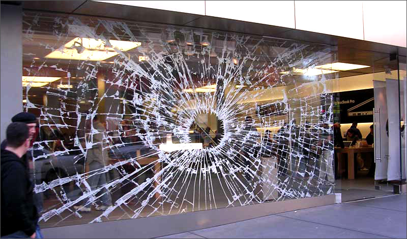
1. "Broken" Apple Store Window

Apple wanted to show customers how powerful their new iPod Hi-Fi was. So they created a custom made sticker to stick to their storefront window to make it look like the glass had shattered.

2. Necklaces in Natan Jewelry

This jewelry store had the brilliant idea of placing stickers of their necklaces on the bathroom mirrors so women could imagine themselves with the necklace on.

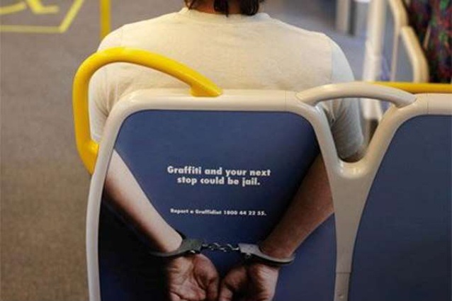
3. Australian Public Transport

In order to minimize graffiti on public buses, the Australian Public Transport Authority came up with the idea of pasting stickers to the bus’ seat backs showing someone with their hands behind their back in handcuffs with the message "Grafitti and your next stop could be jail." Effective and creative.

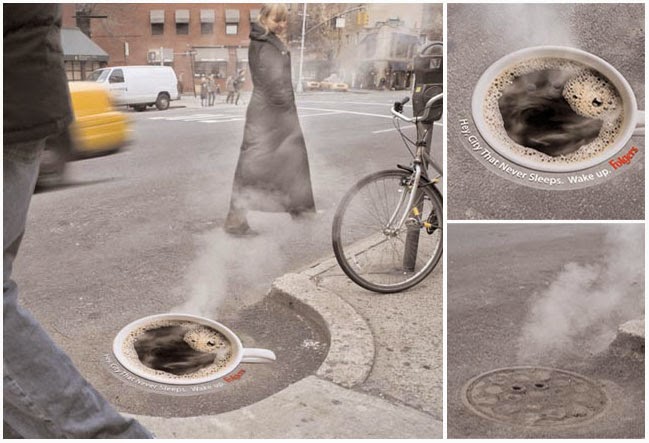
4. Folger’s Steaming Coffee Mug

Folger’s had the brilliant idea of pasting a sticker of a full cup of coffee over manholes. When steam comes out of the manholes, it looks just like a steaming cup of coffee.

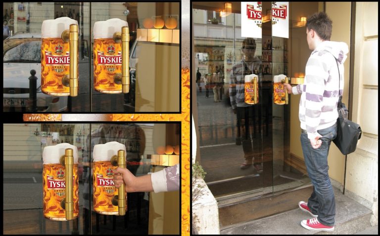
5. Tyskie Beer’s Door Handles

This beer company had the brilliant idea of placing stickers of beer mugs over their door handles to simulate picking up a frothing mug of beer.

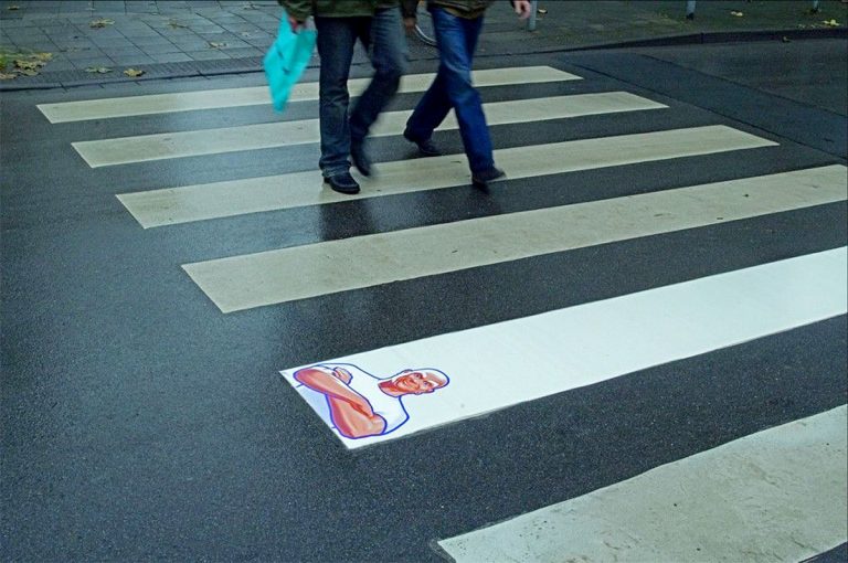
6. Mr. Clean’s Crosswalk Strip

The famous floor cleaning product showed its stuff by placing an ultra-white sticker over a crosswalk strip with the iconic Mr. Clean stamped over it.

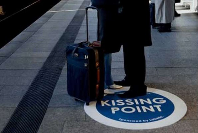
7. Labello’s Kissing Point

Lip balm brand Labello decided the best way to market their product was to paste stickers in public transport stations that read "Kissing Point".

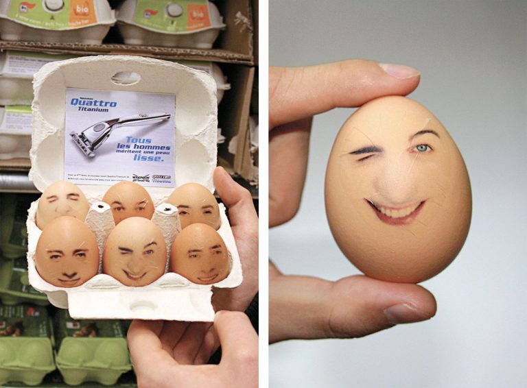
8. Wilkinson’s Eggs

The razor manufacturer Wilkinson advertised their Quattro Titanium razor in one of the most unusual places: egg containers. They pasted stickers of men’s faces on the eggs to show off what a smooth shave their razors could provide. Definitely one of the most creative uses of stickers in marketing.

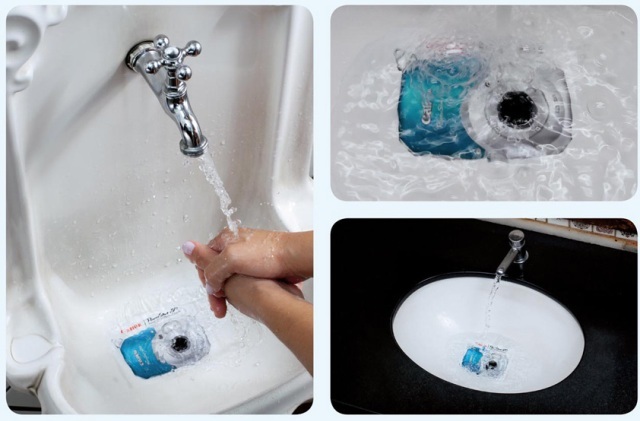
9. Canon’s Underwater Camera

Canon decided to market their new underwater camera in the best place you could imagine. They placed stickers of their camera in sinks in public places to show that their camera could withstand submersion under water.

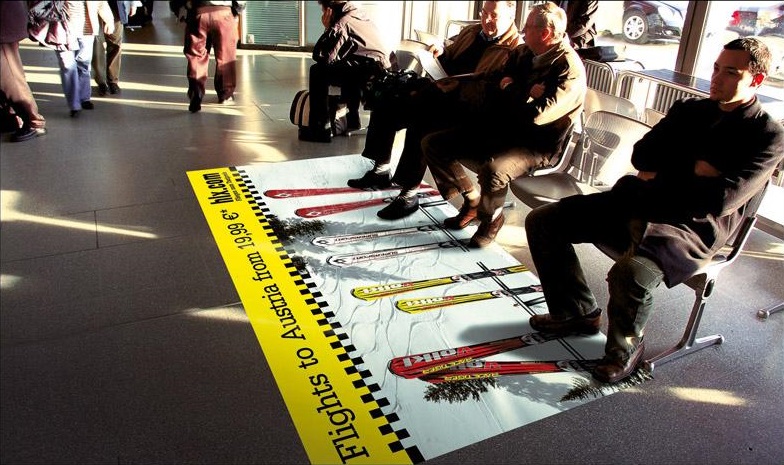
10. Hix.com’s Ski Vacation

Travel agency hix.com placed stickers in front of public benches with sets of skis and a message "Flights to Austria from 19.99 Euros".
If you’re looking to use vinyl stickers for your marketing campaign - you should definitely check out Asset Print.

How Effective Is Flyer Distribution?

With marketers looking for advertising opportunities with the biggest bang for the buck, flyers are almost always at the top of the list.


Flyer distribution services remain relevant even in this digital age. In fact, experts at the Direct Marketing Association (DMA) claim that a well-organised flyer distribution strategy is still highly effective compared to other marketing strategies. Good organization means proper planning, targeted design, an efficient distribution strategy, and a diligent tracking system.
According to a recent DMA report, 79 percent of recipients glance over the contents of a flyer, after which they choose to either keep it or pass it on to a friend. This dramatically increases the reach of your flyers, compared to 38 percent of people who notice TV advertisements, or 19 percent who take an interest in adverts printed in the press and magazines.
Small, medium, and large businesses can use a flyer distribution marketing strategy. It is budget friendly for small businesses trying to reach local prospects, and economical for large businesses to communicate with their customers in different locations.
Here are some interesting DMA stats showing the effectiveness of flyer distribution:
  • 78 and 79 percent of consumers glance at door drops and direct mail, while 23 and 32 percent proceed to read them properly, respectively. Flyers with some kind of discount or money-off coupon are kept by 33 percent of recipients.
  • 71 percent of consumers who receive coupons, free samples, and offers at the right time in their purchase journey claim that the information helps them to narrow down their options. The same results are reflected in 66 percent of consumers who receive supermarket offers, 62 percent who receive money-off coupons, and 47 percent who receive new product flyers.
  • 48 per cent of flyer recipients actually visit the advertised business, request more information, or make a purchase.

Plan Your Flyer Distribution Advertising Strategy

Flyer distribution services provide one of the most cost-effective yet results-oriented strategies to promote or advertise products, brands and businesses. Flyers allow you to communicate with your audience in a undemanding manner, so they can easily take in the information and refer to it when the need arises.

But the low-cost nature of flyers also increases the risk of being wasteful. To prevent this, plan your distribution strategy well. Take your time to understand your target audience and design the flyer for them, using colours, images and words that they can relate to. Furthermore, decide whether you’re going to use A4 flyers, A5 flyers or A6 flyers. Then choose the areas to distribute your flyers, in the streets or using direct mailing, as you track and measure the response.

Always ensure you’re getting high quality flyers printed by an experienced printing company like Asset Print.


What Is A Canvas Print? All You Need To Know

Whether you want to display a family vacation or a timeline of school photos, canvas prints are an eye-catching way to show off your favorite photos. Not only do they liven up any space, they’re an artistic way to update a room.

For ideas on how to use custom canvas printing from Asset Print to build collages or display unique messages that represent your home, check out these gallery wall ideas.

What Is A Canvas Print?


Canvas printing, not to be confused with a canvas painting, is when an image printed from an inkjet printer onto canvas. Once printed, the canvas gets stretched onto a frame. Some people opt for a frameless border while others prefer framed canvas prints. To create an unframed canvas print, many use the gallery-wrapping technique. During this process, the canvas is wrapped around the stretcher bars and secured to the frame.
There is common confusion between mounted prints, acrylic prints and canvas prints. A mounted print is a paper print attached to a backing board. The emphasis of this print is to preserve the photo and prepare it for framing or hanging on a wall.
An acrylic print takes an image printed on photographic paper. The image is then placed between sheets of acrylic, often referred to as plexiglass. When comparing the three types of prints, canvas prints evoke an artistic feel. This is because they’re similar in appearance to oil and acrylic paintings.

What Is Canvas Made Of?


Canvas is a strong and durable fabric created with hemp. In more modern times, cotton and linen have replaced hemp. Most of the canvas prints that you buy for your home use cotton or polyester. The main difference between the two is the exactness of the color.
Color seeps into cloth made with cotton fibers while it remains on the surface of synthetic polyester strands. Because of this, polyester prints are more vivid and cotton prints are longer-lasting.
So which is better? It depends on what you’re looking for. Many consider cotton prints higher-quality and closer to what you would find in a museum. But polyester is the more affordable option, and it also yields bold and colorful prints.

Canvas Prints Vs Framed Prints

In modern decor, it’s common to mix canvas prints and framed prints. There’s a reason for that. Framed prints tie into the general decor of a room by connecting the color scheme with the frame. They also shift the mood of the photo or artwork with the type of frame chosen.
With a simple black border frame, the focus remains on the artwork or photo. But more stylized frames like contemporary or traditional, bring out the character of the photo. When choosing frames, the furniture and room decor are important to maintain cohesion.
In comparison, canvas prints provide a more versatile approach when decorating a wall. You can add them with much less thought since the frameless borders adapt to any style. The vibrant pops of color create new focal points that liven up the room you’re decorating.
Here are some important factors to consider when comparing the two:

Canvas Prints
Framed Prints
  • Image printed is permanent
  • Canvas provides a different texture that adds color depth
  • Photos do not have a glare or reflection
  • Light in weight
  • Prints come in a glossy or matte finish
  • Can swap out many photos in a frame
  • Frames complement room decor
  • Photos can have a glare or reflection
  • Larger frames are heavy and can be difficult to transport
  • The bigger the image, the more expensive the frame

Printing On Paper Vs Printing On Canvas

Photography has come a long way since developing film in a darkroom with photographic paper. Yet printing on paper is still the traditional method that many people trust. To get a better understanding of the differences between printing on paper and canvas printing, let’s explore the advantages and disadvantages.
Printing on paper advantages – We’re most familiar with printing on paper so we know what to expect. The smooth surface depicts sharper details which is important when re-producing smaller prints.
Printing on paper disadvantages – Paper prints can have a glare or reflection caused by sunlight. They’re not ideal when reproducing artwork since paper lacks the texture found in canvas. Finally, framing a paper print can become costly when considering large print sizes.
Printing on canvas advantages – We’re conditioned to seeing art completed on canvas. Because of this, printing on canvas is the preferred choice when going for a "painted" effect. Canvas prints enhance many decor styles with the contemporary gallery-wrapped edges. For large prints, canvas is the more affordable option that also outlasts paper because of the durable plain weaving.
Printing on canvas disadvantages – The texture of canvas is ideal for art, but can distract from photos. That’s why careful photo selection is important. It’s also good to use a system that alerts you of poor photo quality, which is a feature included when customizing one of our prints. Unlike paper prints that you can swap out of a frame, canvas prints are permanent.

What Size Canvas Prints Should I Get?

When it’s time for a wall decor update, canvas prints are a simple way to transform your walls. They add texture and a stylish visual aesthetic. Whether you select one or two large canvas prints, they’ll enrich the colors and furniture in any room.
To get a better understanding of standard print sizes, check out our canvas sizing guide. If the wall you’re decorating is complete and you’re looking to make an update, you’ll need to have a size in mind. But if you’re working with a blank slate, you’ll want to map out your vision for your wall.


The effectiveness of business cards to create business contacts

With most business being done digitally, you might think that business cards don't matter anymore. But they can offer a lot. Here's why they're still important for business and how you can get the most out of yours.

Why Business Cards Still Matter
Business cards still matter because our memory sucks. How many times have you met someone, spent most of the conversation thinking of what to say so you don't sound stupid, then promptly forget their name when it's all over? Some experts explain:
...when you meet a person at a business event, get their business card. Perhaps even write a note or two on the reverse side of the card to capture the key points of your conversation while they're still fresh in your mind. The bottom line here is to have a physical record of contacts you make so you can follow up as appropriate in conjunction with your broader job search/career development efforts.
A business card is a road-map to opportunity. It could lead you to a great new job, a great business partnership, or simply help your business make money. Think of a situation where you've got your networking pants on and you're looking to benefit your business by making contacts. Suddenly, you notice someone that could be a potential client. What do you do? You introduce yourself and describe what you do, but at some point, you'll need to hand off your contact information. A business card saves you time and makes you look professional. You're not fumbling around with a pen to scribble your e-mail address on a cocktail napkin, and you also give them a sense that this isn't your first rodeo.
Not only is your first impression important, but business cards provide tangible information for others. Experts explain that it gives them something physical to refer to later should they decide they want your product or service:
Business cards put a face to a business – When meeting someone new, handing them your business card (preferably with your photo on it) will help keep your business in the back of their minds. Though they may not need your product or services today, there may come a time when they do, and hopefully, they will be able to pull out your business card and call versus trying to remember your company name and searching the web.
Your business card is a physical object that potential clients can take with them that keeps you or your brand from just being a name that floats around in the ether. It's great if you have a website, but a commercial printer that prints cards have certain perks:
Business cards never have downtime. They're always accessible, and never have dead zones or Internet outages. Your business card can be viewed no matter where you are located, and even times when cell phones and other devices must be turned off, such as on an airplane ride or in a hospital. Your business card is always working for you.
Not everyone thinks business cards are essential, and some argue business cards have lost their edge. Expert says:
As for me, I haven't had business cards for many years either. Instead, I make a point to ask my new connection to email me. (When I respond, I include my full contact information.) It's become normal to see people at networking events in the USA using their phones to collect contact information right there on the spot. Fast-forward a few years, and it won't be surprising to find Google Glass-wearing techies exchanging contact information by looking at each other.
Technology, and—more specifically—smartphones have made information sharing easier. These days you can email someone while you're meeting them with a few quick taps of your thumb. There are even apps out there that can share contact information with someone with barely any effort at all. So why bother with a card when you have all of this other stuff? Networking is about making meaningful connections, and sometimes technology—or the act of using it—can be impersonal.

Eight Power Networking Tips to Make More Meaningful Connections

You've heard it a million times: Career advancement is as much about who you know as what you…
Meeting someone in person only to look down at your phone and start tapping can seem rude and disconnected. You want to smile, make eye contact, and make the conversation you're having be your main focus. You don't want to be hoping they have the same information sharing app, asking for their email immediately to send your info, or looking down at your screen. Technology can still be used to enhance your experience, however. Apps like Evernote can scan the business cards you collect and make storage and organization easier. But business cards already use one of the best information sharing apps out there: your hands. Until we actually can look someone in the eye to share information, you're better off keeping conversations personal and connected.
I've Been Using Evernote All Wrong. Here's Why It's Actually Amazing...
For years, I kept hearing how awesome Evernote was: how it could store everything you possibly…
Business cards are cheap, portable, and easy to give away, so there's no reason not to have one. Even with email, LinkedIn, Facebook, Google+, and Twitter, people expect you to have a business card. It shows professionalism and it demonstrates that you care. In a sense, business cards are a way for you to say, "I belong here, I know what I'm doing, and you should consider me a factor." They are a paper handshake that instantly gives whoever you meet everything they need to know in order to do business with you.

What Should Be on Your Card and How to Make It Stand Out

What goes on your business card largely depends on what kind of business you're in—or want to be in—and whether or not you have the ability to make your own. If you work for a large company your card might be predetermined, but that doesn't mean you can't use something of your own design. Either way, there are a few essentials you should include.
Be deliberate about the information you include and keep clutter to a minimum. You don't want the most important bits of information getting lost in a mess of words and numbers. You need your name—or name you go by—and job title on the card, along with the name of your company or what you do. List your business phone number, work email, website, and possibly the location of your business if that's important to know.
Put your information on the front and leave the back blank. If you're adventurous you can experiment with different styles or maybe a logo on the back, but for a solid card style, you can rely on keeping things basic. Experts recommend keeping the back of your card blank:
How often will people see the back of your business card? Traditional card storage modes assume that side is blank. If you do wish to put the copy on it, be sure the information is of a supplemental nature: e.g., your company's mission or tagline. While business cards should promote your brand identity, they shouldn't be confused with advertising.
Use white as the base color of your card. That way, people who have received your card can write visible notes or additional info on the front and back.
Stick to the standard size of 2" by 3.5". It may seem like an easy way to make your card stand out from the crowd, but more than likely you'll get your card tossed because it won't fit in someone's wallet or other business card holder. Remember, the idea of the business card gives them reference information after you've wowed them or pique their curiosity so that you can wow them later on. You don't necessarily need to wow them with bizarre card shapes or confusing designs.
Use your photo and add value to your card. Some experts suggest putting your gorgeous mug on your card:
Why include a picture? "You go to a convention, and you come home with 55 cards in your pocket," Crowther says. If one or two cards have photos, you'll remember those people.
Some people also suggest that including some sort of incentive on your card will increase the likelihood of others getting in touch with you. You can offer discounts, special services, or even advice if that fits your business. You want people to remember you and feel like getting in touch with you will benefit them.
Some other tips on standing out worth considering:
Incorporate QR codes: The jury is still out on this, but for some professions—like tech-related careers—QR codes can be a great way to direct people to a web page filled with important information that could never make it on a card. It also, however, takes up a great deal of space, so don't let it become clutter.
Spend more on quality: You can buy basic business cards for very cheap, but you may want to consider the message you're sending with cheap paper and print jobs. Think of how a nice magazine feels in your hands compared to a floppy tabloid. Regardless of what's inside, the magazine feels better and seems more professional.
Choose the right font: Keep your fonts 12 points or larger and make sure they are legible! It's okay to play around a little here, but if you're even a little bit concerned if others will be able to read your card, pick something else.
Consider professional help: One way to ensure you get what you need is by hiring someone whose job is to design. Graphic designers know their craft and they can come up with something clever, informing, and professional.
All in all, there are three keys to a perfect business card: it contains all vital information needed to contact you, it entices people to learn more about you or get in touch, and it stands out without being too different.
An often overlooked feature of business cards is quality - make sure you use an expert printing company such as Asset Print.

Printing Lingo: What is a Rack Card?

A Rack Card is a simple and cost-effective promotional piece, usually printed in full color on one or both sides of heavy cardstock.
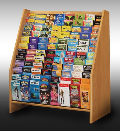
The standardized size of rack cards (typically 4" x 9" or 3.5" x 8.5") allows them to fit into a specifically-designed display rack or counter-top holder for easy access by potential customers.

What types of Businesses use Rack Cards?
Rack cards can be used by almost any business or organization. They are popular for lobbies, showrooms, waiting areas, and trade shows…as well as for Point of Purchase (POS) marketing. Rack cards also have widespread use in the tourism industry. You have likely seen a large display of colorful rack cards in a hotel, airport, restaurant, visitor center, or other venue while traveling.


An example of a large display case used to hold multiple Rack Cards

How do Rack Cards attract Customers?
In most cases, a rack card is geared toward foot traffic…so its marketing message must entice the people walking or standing nearby. The goal is to have a potential customer notice your message, take the card with them, and ultimately respond to your call to action.

Hence, rack cards must be designed to grab and hold a prospect’s attention. This is accomplished through the creative use of compelling colors, engaging images, and brief but persuasive text. In addition, racks cards are often gloss-coated to add sheen and increase the vibrancy of the ink colors.

What can be Printed on a Rack Card?
Though relatively straightforward in construction, racks cards are actually very versatile. In fact, they can be printed with any content or layout you choose…including promotional offers, upcoming events, information about products or services, discount coupons, contact info, directions, maps, QR codes, or anything else that helps build awareness and sales.

Also, the layout of most rack cards is created with a vertical orientation, as that is how they are normally positioned in a display rack or counter-top holder.

What is the Size of a Rack Card?
Rack card dimensions are typically 4" x 9", 3.5" x 8.5", or something similar. This allows rack cards to fit into standard-sized floor, wall, or counter display racks. It also allows a rack card to fit very well into a standard #10 business envelope, thus serving double-duty as a mailer insert.

If you want to get your business noticed, whilst not over-spending - use rack cards as small, promotional and eye catching pieces. Asset Print can supply you with impressive, quality rack cards for your business needs.


An example of a counter-top holder for Rack Cards


Flyer design: 50 brilliant examples you can learn from


That’s right, those bits of paper that often end up in the trash, trampled in the street, or buried under a pile of bills. But if they’re doing their job (have been designed well), flyers should catch your attention and maybe even get you to take action (attend this grand opening; use that coupon; buy tickets to this concert — you get the idea).

Maybe you’re a business owner and you don’t want your marketing efforts to end up in the recycling bin. Or maybe you need to advertise an event or fundraiser for your club or community organization. Whatever your needs, check out 50 stellar examples below with design tips that will get you inspired for your next flyer design project. And when you’re all ready to design your own printed flyers, contact Asset Print for great flyer designs and printing offers.

Want more flyer inspiration? Then check out our round up of 20 bold, minimalist flyers – or if you prefer a louder style, get inspired by 20 vibrant flyer designs.

01. Embrace Color

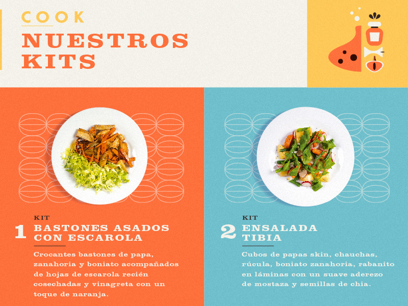
Bright, bold color palettes really give flyers punch and attract attention, even from across a room. This flyer design by Martin Azambuja uses vibrant hues that reflect the fresh ingredients of the dishes the flyer is advertising.

Flyer
02. Mix It Up

Combining different font styles and sizes can give your flyer a distinct look and help it stand out. In this piece from Overloaded Design, 3D effects on the text and some subtle, grungy textures also make the design pop.

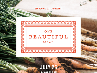
03. Keep It Simple
A simple, elegant design has impact of its own. As with this flyer from Valerie Jar, text is kept to a minimum and the design elements are spaced generously. The edge-to-edge background photo and clean white-and-orange centerpiece also help give the flyer an understated sophistication.
Valeriejar dribbble obm
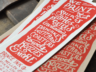
04. Blast from the Past

The handcrafted look is big right now (whether designs really are handmade or are just created to look like it). This screen-printed flyer from The Prince Ink Co. features whimsical, hand-drawn typography, which is very appropriate for a print company that runs all its prints by hand. Using a “form equals content" approach to design like this can be very effective.

Dribbble bookmark
05. Play With Patterns
Patterns make a striking visual statement, whether you use them throughout your design (like in this flyer by Joris Rigerl) or just as an accent. Because the human eye naturally notices patterns, including them in your design is a surefire way to get more people looking at your flyer.
Be flyer final both dribbble
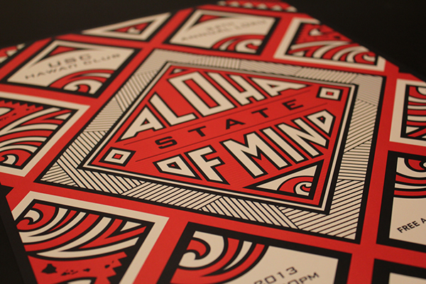
06. Study Shapes

Like patterns, shapes are a great attention-getter, especially when applied creatively. This flyer design by Justin Krout uses shape in both the text and the graphics. Notice how the tilting shape of the text makes for a unique and eye-catching title, while the mountain below is made up of triangles of all shapes and sizes, creating a multifaceted, almost 3D effect.

Tacoma Film Festival by jkrout555
07. Work the Details

Finely detailed graphics can be stunning, but how do you avoid making your design look too busy? A limited color palette helps, as does a focus on symmetry and balance, like in this flyer design by Kristie Kam. This flyer also keeps things polished by sticking to a visual theme — in this case, a heavy emphasis on geometric shapes and patterns.


08. Pick a Color Scheme

Choosing a cohesive color scheme (maybe the colors in your company’s logo) and/or staying in the same color family or temperature (warm or cool) really pulls your flyer design together. This folding flyer by Evan Travelstead sticks to cool blues and grays against bright white for a clean, polished look.


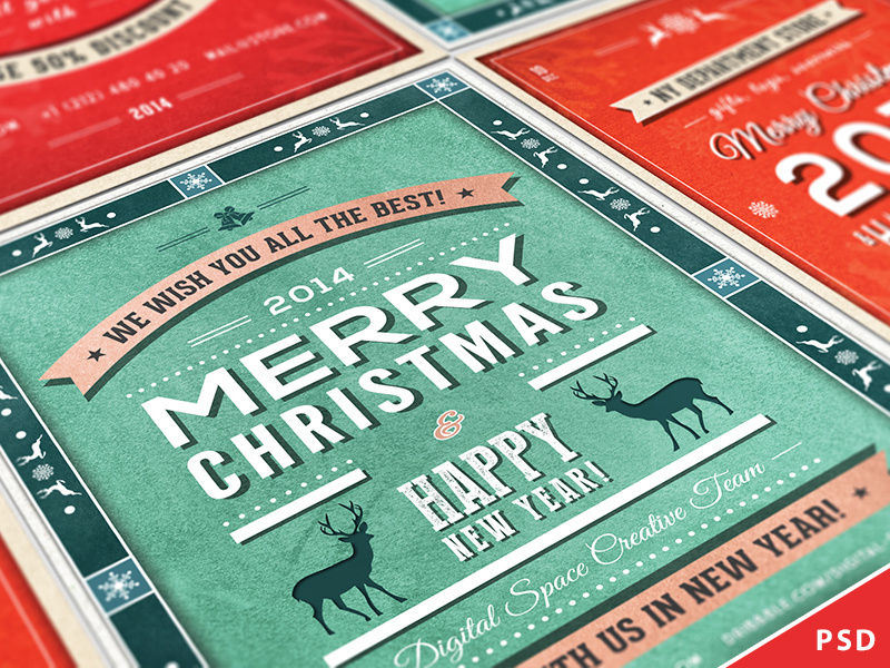
09. Get Seasonal
If you’re designing a flyer for a holiday or event associated with a particular time of year, capitalize on that and use imagery associated with the occasion. Viewers will immediately relate to the design because it’s familiar or nostalgic. This design from Digital Space uses reindeer and snowflakes in a sleek, retro-inspired way that’s creative rather than cliché.

Retro christmas and new year flyers collection by digital space
10. Make Space

Paying close attention to spacing and alignment is an important step in the design process — one that can make or break a project. See how in this flyer by Pashlov Egor, all the icons in red are approximately the same distance apart? Though there’s a lot going on, everything fits together nicely, almost like puzzle pieces, without looking crowded.

Sota plus

11. Go the Extra Mile

When’s the last time you saw coupons with hand-drawn illustrations? Giving your design that extra personal touch, like Mel Larsen did in this flyer, will be sure to catch the attention of your viewers and give them a good impression of your brand or organization.


12. Rough It Up

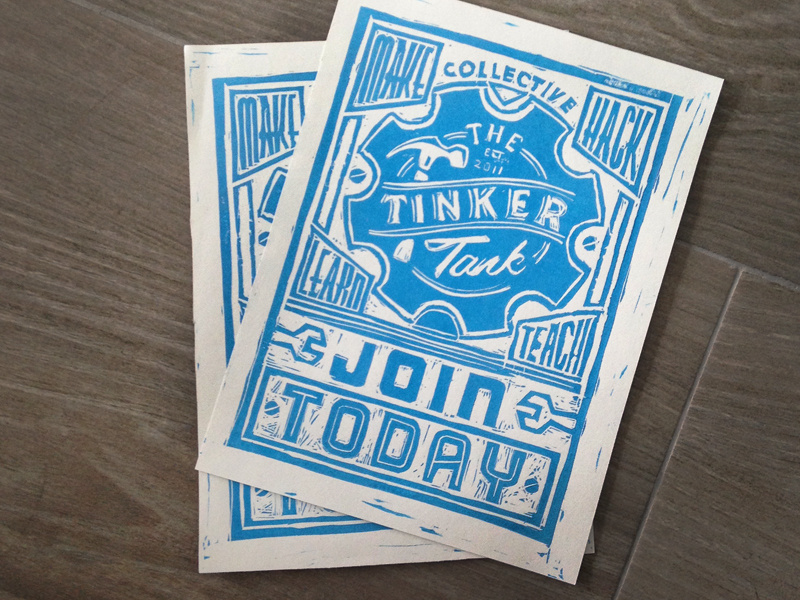
Designs that are textured or a little rough around the edges can be a nice contrast to all those more slickly produced flyers out there. As with this hand-carved block print by Jack Daniel Bagdadi, sometimes designs (much like people) are all the more appealing and dynamic for their little imperfections.

Tinker lino

13. Lead In

Take a page from art class and use the concept of leading lines. A common composition trick in art and photography, leading lines are just what they sound like — they lead in to the part of the image that the artist wants viewers to focus on. In this design by Macrochromatic, the diagonal lines of the mountains intersect with the sides of the red triangles to form arrows that point right at the band’s name.

Stay tuned for Part 2...


Article source: